Let’s be real: shopping online can feel like a gamble. You can’t touch, feel, or try a product before you buy it. That’s why your Product Detail Pages (PDPs) have to do all the heavy lifting—they’re the silent sales team, the product demo, and the brand ambassador, all rolled into one. Without a stellar PDP, you’re just one click away from losing a sale.
According to BigCommerce, a huge 81% of shoppers research online before they commit to a purchase. If your PDPs aren’t up to scratch, they’ll simply find what they need elsewhere.
Whether you’re just starting out or you’re a seasoned e-commerce pro, this guide will help you take your PDPs from basic to conversion-driving superstars. Ready? Let’s dive in.
Why Product Detail Pages Matter
Imagine walking into a store where products are tossed on shelves with no rhyme or reason, no price tags, no friendly help in sight. Not a great experience, right? The same goes for online shopping. Your PDPs should be like that perfect store associate—knowledgeable, approachable, and helpful without being pushy.
According to the Baymard Institute, almost 70% of online shopping carts are abandoned. And it’s often not because people don’t want to buy but because they didn’t get the answers they needed or felt unsure.
Your PDPs matter because they:
- Drive Conversions: Well-designed PDPs can boost your conversion rates by 30% (Shopify).
- Build Trust: Transparent, detailed product info and clear policies make shoppers feel safe and valued.
- Improve SEO Performance: Optimized PDPs get higher search rankings and pull in more organic traffic. Want to integrate SEO seamlessly? Check out our SEO Website Design guide.
How to Optimize Product Detail Pages for More Conversions
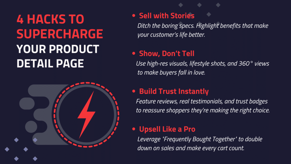
1. Write Descriptions That Actually Sell
Forget the bland, feature-dump descriptions. Your product description should make someone want to click “Add to Cart” right now. Think of it as storytelling for your product: What does it solve? How does it make life easier or better?
Example: Take Dollar Shave Club. They don’t say, “Our razors are affordable.” Instead, they say, “Our blades are f***ing great.” It’s attention-grabbing and memorable—exactly what you want.
Quick Tips:
- Know Your Audience: Speak directly to your ideal customer.
- Focus on Benefits, Not Just Features: Instead of “Waterproof jacket,” try “Stay dry, rain or shine.”
- Keep It Concise: Use bullet points for key features.
According to Saleslion, 88% of shoppers consider detailed product info a must when deciding on a purchase. Skip the fluff and give them the details they need.
2. Use Visuals That Tell a Story
In e-commerce, visuals do a lot of talking. Clear, high-quality images and videos are your best bet to bridge the gap between “maybe” and “buy now.”
Brands that nail it: Look at ASOS. They don’t just give you one image; they give you multiple angles, close-ups, and even videos of a model wearing the product. You’re not just seeing the item—you’re seeing how it moves, how it fits, and how it looks in real life.
Quick Tips:
- Multiple Angles: Show the product from every angle.
- Zoom Feature: Let customers get close for details.
- Lifestyle Shots: Help them picture it in their lives.
- User-Generated Content: Real customers, real photos.
And if you need proof, 75% of online shoppers rely on product photos when deciding to buy (Weebly).
3. Highlight Key Information Clearly
Shopping shouldn’t feel like a scavenger hunt. If your PDP hides essential details, you’re practically inviting shoppers to leave.
Who does it right? IKEA. They list dimensions, materials, instructions, and everything you need to know upfront. No one’s left wondering.
Quick Tips:
- Price, Stock, Specs: Clear and prominent.
- Shipping & Return Policies: Easy to spot and read.
- FAQs: Address common questions right on the PDP.
Baymard Institute found 64% of users feel unclear shipping costs lead to abandoned carts. Don’t let missing details be the reason someone clicks away.
4. Optimize for Site Search
It’s simple: if people can’t find your product, they can’t buy it. Site search is key here.
Quick Tips:
- Relevant Keywords: Consider adding specific, targeted keywords related to the products you are featuring on your site.. For example, if you’re selling electronics, include product-specific keywords like ‘Bluetooth speaker,’ ‘noise-canceling headphones,’ or ‘4K smart TV.’ This will improve site search accuracy and help users find what they need more effectively.
- Autocomplete and Suggestions: Use a site search tool that provides autocomplete and smart suggestions to help users find products faster.
- Synonyms and Spelling Corrections: Ensure your site search accommodates spelling variations and synonyms so customers find what they need, even if they type it differently.
For more on improving search, check out our post on Navigating Linguistic Diversity with Auto-Synonyms.
5. Social Proof and Trust Signals: Let Your Customers Do the Talking
Nothing sells better than happy customers vouching for you. People trust other people’s experiences.
Example: Sephora nails it with video reviews and tutorials from real customers and beauty influencers.It shows the product in action, while keeping the experience authentic and relatable.
Quick Tips:
- Reviews and Ratings: Let customers share their feedback.
- Testimonials: Include customer stories.
- Trust Badges: Display guarantees and certifications.
- Real-Time Purchase Notifications: Show recent buys for added urgency.
Nearly 95% of shoppers read reviews before buying (luisazhou.com). Make reviews a PDP staple.
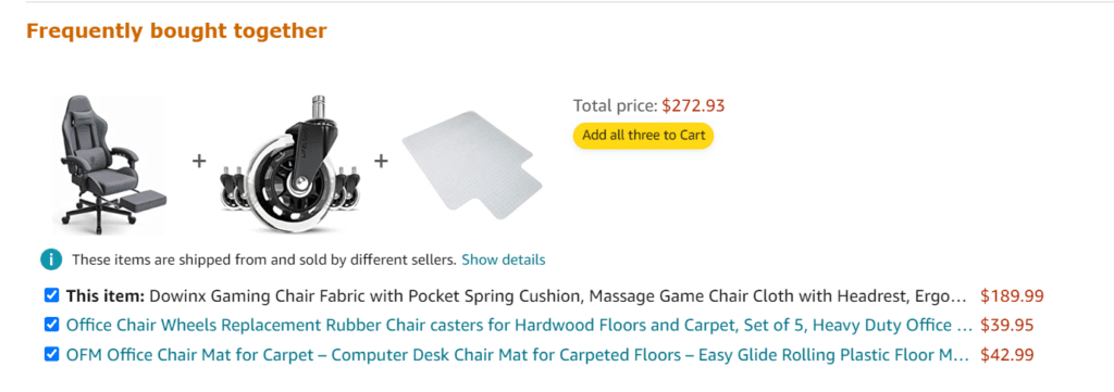
6. Boost Sales with “Frequently Bought Together” Suggestions
You’ve seen it on Amazon—a “Frequently Bought Together” section that shows items that complement the main product. It’s not just a helpful addition; it’s an upsell tactic that works.
Example:

Amazon’s ‘Frequently Bought Together’ upsell is a game-changer—portentialy turning one purchase into three by showing what other buyers love to pair together. The FBT feature is responsible for a 35% boost in their sales (McKinsey).
Quick Tips:
- Related Products: Suggest items that go well together.
- Bundles and Discounts: Offer value with a combo pack.
- Personalized Recommendations: Tailor options based on browsing history.
With AddSearch’s product recommendation tools, setting up these suggestions is a breeze.
7. Cater to the Customer Journey
Remember, not everyone is ready to buy the first time they land on your page. Think about where your customer is in their journey and tailor your content to guide them along.
Example: A new visitor might need an introductory video, while a returning customer might look for reviews and FAQs. Guide each type of shopper with relevant info.
Quick Tips:
- Awareness Stage: Show off benefits and lifestyle shots.
- Consideration Stage: Highlight comparisons and FAQs.
- Decision Stage: Make it easy to buy with clear CTAs and trust signals.
8. Personalize for Better Engagement
Personalization is a huge conversion booster. It’s why platforms like Netflix and Spotify feel so “right” every time you log in.
Quick Tips:
- Dynamic Content: Show products based on recent browsing.
- Custom Offers: Reward returning customers with discounts.
- AI Chatbots: Help shoppers in real time with suggestions.
According to McKinsey, personalization can drive a 20% sales increase. Tailor PDPs to the individual and watch your conversions grow.
9. Boost Your Organic Reach with SEO Strategies
Optimizing your product detail pages for search engines is crucial to ensure your products reach the right audience. Here are some strategies to help:
Use Long-Tail Keywords
Long-tail keywords may have lower search volumes, but they often show higher purchase intent. In fact, 70% of all web searches are long-tail keywords (Moz).
For example, instead of targeting “running shoes,” try something more specific like “men’s waterproof trail running shoes.” This specificity helps attract customers who are ready to buy.
Optimize Image Alt Text
Alt text (alternative text) does more than describe an image—it’s important for both accessibility and SEO. Screen readers use it to help visually impaired users understand images, and Google uses it to better understand image content, which in turn helps with search rankings (Google Developers).
Keep your alt text clear, descriptive, and include relevant keywords. For example, “Red women’s cashmere sweater with V-neck.” It boosts your search rankings while keeping your site inclusive.
Quick Tips:
- Long-Tail Keywords: Use specific phrases to attract ready-to-buy customers.
- Alt Text Optimization: Write clear, descriptive alt text for images to boost SEO.

Enhancing User Experience on Product Detail Pages
1. Mobile-Friendly Design
More than 50% of global web traffic is mobile (Statista). Make sure your PDPs look great on every screen.
Quick Tips:
- Responsive Layout: Optimize for all screen sizes.
- Easy Navigation: Thumb-friendly buttons and simple menus.
- Fast Loading Times: Compress images and clean up code.
2. Don’t Make Them Wait—Speed Matters
53% of mobile site visitors will leave if a page takes over three seconds to load (Google).
Quick Tips:
- Image Compression: Use smaller files without losing quality.
- Minify Code: Remove extra code to speed things up.
- Cache Static Resources: Reduce load time for repeat visitors.
3. Make Layouts Clear and Intuitive
Your PDP should be easily navigable, with a logical flow that makes finding info simple.
Quick Tips:
- Consistent Design Elements: Keep it clean and branded.
- Whitespace: Avoid overcrowding; let elements breathe.
- Hierarchy of Information: Show the essentials above the fold.
Wrapping It Up
Your Product Detail Pages are where browsing turns into buying. Make them informative, visually appealing, and easy to navigate, and you’ll turn more clicks into conversions. Every little detail—from the product description to the visuals to the upsell suggestions—plays a role in creating a seamless shopping experience.
Want to see how AddSearch can supercharge your search and discovery experience? Request a demo today, and let’s make your e-commerce site the destination customers love to explore.


