When was the last time you installed software on your computer? Maybe that was some time ago. That’s because today, we can find a lot of tools and software that we need for our private and work life on the Internet as so-called web apps.
The use cases for web applications are manifold. Most, however, work with a large amount of data, which is often user-generated. And, of course, this data must be quickly and easily found. Let’s discover what you need to know about in app search for web apps, how to create one, and how a site search platform can help you with that.
Table of Contents
Does your web app need a search?
Depending on your business and web app type, you might not need a search at all. Let’s say you’ve built a game or a settings dashboard for your IoT device – search functionality is most likely not necessary. Offering a search bar can actually do more harm than good in these scenarios. It could make your web application too complicated and confuse users.
However, if you offer a lot of information, products, location data, user-generated data, or other versatile data, search functionality can significantly improve your app’s user experience (UX). Imagine Twitter without a search bar. How would you find other users or hashtags? Or, let’s say you want to rent an Airbnb. It would be impossible to find the perfect place to stay if you couldn’t search by destination. If users can’t find what they’re looking for effortlessly, they will probably say goodbye to your app and switch to another.
AddSearch tip:
Improving your web app’s UX by enhancing your search is an excellent step to avoid this situation. The more intuitive, accurate, and fast your search, the faster users can achieve their goals. And no matter how lovely your web app is, users probably don’t want to spend too much time with it. They want to use it to get things done efficiently and effectively.
What are the key ingredients of successful search design for web apps on desktop and mobile
We’ve already written about creating a great search UI on our blog – there are many things to consider when designing a search. Unfortunately, there is no way we can get into all of them in this blog post.
However, we’re going to examine some of the essential aspects of an intuitive and easy-to-use search for web apps (or in app search) to get you started.
Search position and design
In general, you should always place your search where users expect it and can easily find it. See how other apps do this to see what users are familiar with. As you examine different apps, you will find these popular ways to display and position search:
Add a visible search bar at the top
The upper section of web apps (and even websites) is typically a popular place to display search bars. If your app has navigation at the top, it’s a solid idea to put your search bar there. For example, in Google Drive, you can swiftly find folders and files using the prominent search bar at the top:
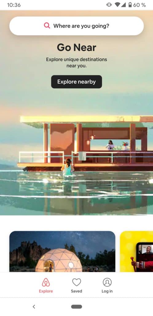
You can also take this approach for the mobile version of your app. However, this takes up quite a bit of space – something that is precious in mobile design. If the search is well designed and plays a vital role in your app, this is still a valid option. The Airbnb web app is an excellent example of a full-width mobile search bar. Since most people use the app to book a place at a specific location, having instant access to the search saves a lot of time.
Use a search icon at the bottom or top on mobile
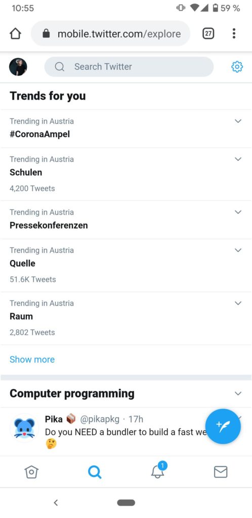
Mobile web apps often have horizontal navigation made up of icons. For example, Twitter displays a search icon at the bottom of the app, alongside other essential navigation items, such as direct messages, home screen, and notifications. Once you tap the search icon, you navigate to the search interface, as you can see on the screenshot below.
This approach to mobile search is especially useful if you have a native mobile app that looks similar. Most times, it’s advisable to implement a similar design and layout for your different app types so that users can feel right at home on any device.
AddSearch tip:
Did you see how the search was presented in the examples above? Most web apps use the magnifying glass icon that users are already familiar with. Also, notice that the search bar often contains helpful placeholder text to encourage the use of search, such as “Search” or “Search for hashtags, people or places.” We recommend following search design best practices and incorporating design elements that your users are familiar with.
Displaying search results
Showing search results in your web app can also be a science in itself. What works best for your app will, of course, depend on your specific use case and the searchable data. As you can imagine, a video-based app like Youtube wouldn’t work if it displayed text-based search results as Twitter does.
Especially with the mobile version of your web app, you need to take into account that a smartphone’s screen is relatively small. Consequently, you can only display little information. For example, if you create a hotel booking app, you should show the room price and the number of stars in the search results and avoid less essential details such as room service information.
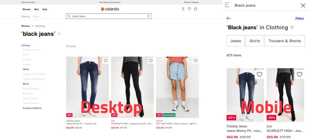
Let’s look at an example. You can see the search results for the query “black jeans” on Zalando’s desktop and mobile web app in the screenshots below. For each product that matches my search, the app displays an image, brand, product name, and price. These are all essential criteria that help me – the customer – find what I’m looking for.
Filter and sort search results
Provide users with filters and sorting capabilities to fine-tune their search results and reach their goals as efficiently as possible.
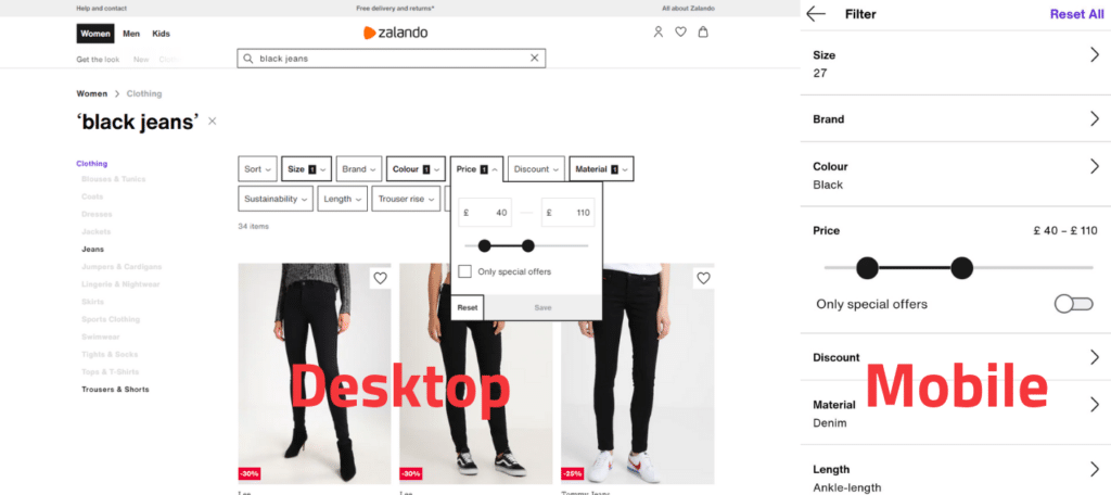
Let’s go back to my search for “black jeans” on Zalando. I received more than 800 search results for this query. Theoretically, I could just scroll through the products and take a closer look at the items I like. However, I probably neither have the time nor the patience for this. That’s why I use the web app’s filters for size, price, material, length, etc. and end up with only about 39 results. Ultimately, those few clicks saved me a lot of time to find a pair of black jeans that meet my expectations and requirements. Of course, that makes me very satisfied as a customer, and I will be using the web app again in the future.
Look at the screenshot again and notice how the web app displays the filters on mobile devices! It makes perfect use of the available space and ensures that all UI elements are intuitive and easy to use – even the price range slider.
AddSearch Tip
Whether your users would benefit from filters and sorting features also depends on your use case, content variety, content number, and the number of search results that your web app delivers on average. The more data you provide, the more useful filters and sorting functions are, of course.
Auto-complete and search suggestions
The big players like Google or Amazon show us how to do it: Offer users auto-complete and auto-suggestions for their search.
Users only need to type a few letters into the search bar to get a list of possible queries to choose from. This way, they can find what they’re looking for faster than if they had to enter everything themselves. Of course, these features are also handy for users who don’t yet know exactly what they are looking for!
Personalized search suggestions
Some search solutions can remember the user’s interests and behavior to display more suitable search suggestions in the future (= personalization).
For example, let’s say you are using an electronics store web app. In the past, that’s where you’ve always bought Apple products. Now you’re back and want to buy a new smartphone. You click in the search bar and start typing the word “smartphone.” After the first letters are on the display, the search suggests you look for “Smartphone,” “Smartphone cases,” “Smartphone printer.” Knowing that you’re an Apple fan and likely interested in buying another iPhone, the search will also offer you some personalized suggestions like iPhone X, iPhone 11, etc.
As you plan and implement in app search for your web app, keep in mind that auto-complete and auto-suggest can help improve your app’s user experience, and increase user satisfaction.
How to implement in app search for web apps
Search is often only a fraction of a much larger project that requires varying degrees of knowledge and skills. Consequently, your in-house software developers are likely to have little to no experience developing a comprehensive search that has all of the functionality required.
This is why you would want to pick a site search platform that already offers the core capabilities along with advanced search features and pre-built UI elements, that make implementation simple. Which provider fits you best depends on your business, your unique use case, and your requirements. Check out our blog post, where we compare three of the most common site search solutions to learn more.
How to choose solution for in app search
When choosing a site search solution, you need to make sure that it actually works for your use case. Some solutions offer automatic crawling and indexing of content. However, single-page applications (SPAs), for example, are technically different from regular websites and crawlers need to be able to access and scan AJAX-loaded content. Additionally, you may have authentication in place that a crawler may not be able to get past. This doesn’t mean that a web crawler is not suitable for your use case at all. Yet, it’s something you should check with the site search provider. If the provider doesn’t offer a web crawler or if your content cannot be crawled, they certainly offer an API that you can use to feed content into the solution.
Naturally, you need to create the actual search interface and provide the required search functions such as retrieving, filtering, sorting, and auto-completing search results. Some providers offer ready-made components that let you build a search UI with all needed features in no time. The downside is that you will be limited when it comes to customizing the design, layout, or even features. If you need more control over your search’s user interface and functionality, make sure the provider enables you to create an altogether custom search experience.
Implement site search for web apps with AddSearch
AddSearch offers automatic crawling and indexing of your content, even if you’ve built a single-page application with React or Angular or if your content is behind simple authentication mechanisms. However, as mentioned above, this may not be possible in certain circumstances. For example, if your app doesn’t work through distinct URLs or has complex authentication mechanisms in place, our crawler might not be able to reach the content on these pages. No worries, though, because our easy-to-use Indexing API allows you to push all types of content into the search index. This also gives you more control over the data stored in the index and enables you to update or delete entries at any time.
We recommend using our Search UI library to build your web app’s search interface. As a result, you can safely provide your web app with the needed search capabilities and create a highly customizable UI. Our Search UI library retrieves data from the search index through an API – naturally, you can also work directly with this Search API. If you want to build the search UI yourself from scratch, use our API client for Javascript. This allows you to tightly integrate the Search API into your code and make it easier to use.
Whatever your needs, we are confident that our site search solution can help make your web app even better. Why not talk with one of our search experts to learn more about your possibilities with AddSearch? Feel free to contact us – we’ll be happy to hear from you!


