Digital accessibility is evolving. It is no longer a ‘good-to-have’ characteristic, but an essential element of every digital product and service. Accessibility is not a PR exercise. Not only does the ROI stemming from a broader client base and an optimized experience make good business sense, but it is also increasingly a global regulatory requirement. Monsido confirms that this is just the beginning: “The number of people living with disabilities is expected to grow considerably over the coming decades which will only give rise to more guidelines, legislation, and enforcement.”
Tiina Heikkilä, Web Developer and Accessibility Lead at Crasman, one of our partner agencies in Finland, joined us in a webinar to share her experience as a certified web accessibility specialist. She explored the need for accessible site search and made recommendations not just on how the search bar could be developed with accessibility in mind, but what needs attention in the search results and suggestions as well.
Table of Contents
What is accessibility?
Accessibility is the principle and practice of ensuring your product or service can be used by anyone. Building accessible websites involves designing and developing the site in such a way that people with disabilities can easily understand, navigate and interact with them. Fortunately, these accommodations can also have advantages for people without disabilities, making your website better for everyone.
Why is it important to have accessible site search?
Accessibility is important because, ideally, you would want your website and your search to be usable by everyone. In addition, laws and regulations around the world increasingly require websites to comply with accessibility guidelines, sometimes fining non-compliant organizations.
In addition, accessibility can have a broader impact than one would assume at first glance, and can benefit a wider range of people. The need for assistive technology can go beyond the physical to cognitive conditions, such as memory issues or learning difficulties which can make a site complex and hard to understand.
In the process of making sites more accessible for people with disabilities and challenges, they also become easier to use for those who aren’t fluent in the language or who are in a crowded place where they are unable to focus, or the people using their device while on the move. This means accessibility opens up sites to more users, whether they identify as people with disabilities or not.

At AddSearch, working with organizations around the world means keeping our search up to date with the latest requirements. It also means we get to partner with agencies who are on the cutting edge of designing holistic digital experiences, and collaborate to create better, more accessible search and websites for everyone.
What role does site search play in accessibility?
As Tiina pointed out right at the beginning of her presentation, if your service is built only with young, healthy people in mind, it would involve significant barriers for others, whether they have to use assistive technology or have a health condition that affects how they interact with your site.
Search is one of the most important features on a website or app, Tiina explained, as the function saves time and effort. This is compounded if the user has a health condition that makes it slow or time-consuming to use their device or struggles with understanding the structure of the site. Accessible site search may also lead users to content they may otherwise not be able to find easily. Giving people multiple ways to use the service allows them to use the way they prefer and do what’s easiest for them.
Experience the Best in Search Solutions with AddSearch – Top Rated on SourceForge! Click for Your Free, Personalized Demo Now.

The 3 key elements of building accessible site search
Now that we’ve established why accessibility is essential, let’s dive in to what needs attention when creating an accessible site search experience for your users. There are 3 key areas to focus on: the search bar, the results, and the search suggestions. Each element has its own unique challenges and considerations, which we explore here.
Do keep in mind also that the assistive technology being used will have an impact on the requirements. There are a variety of devices available, and it’s important to know what each does and how they interact with your website and search in order to develop truly accessible site search.
The goal is for all the users to be able to:
- find the search functionality,
- understand what it is and how it works,
- to operate it with their technology,
- know whether or not results have been updated,
- perceive the results (while this may seem simple, it may not be that obvious if they’re using a screen reader), and
- select the results and go to the link.
Several elements go into making this work; let’s find out what they are.
1. How to make an accessible site search bar
Place the search bar well
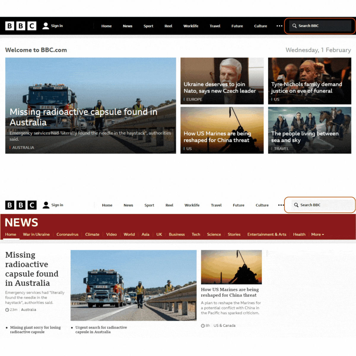
The first step to making the search bar accessible is deciding on the location of the search on the site. Its placement should be easy to find, somewhere people would be familiar with and where they would look for it. The most common placement is the top right corner or the middle of the header bar, high up on the page.
It also needs to be easily recognizable. The magnifying glass symbol is easy to identify, even if the user doesn’t read the language on the page. It would still be good to include a visible label that says ‘search’.
Another aspect to consider is consistency. The location of the search should not change from page to page. If it is first placed on the top right corner, then it should remain there on all the pages.

Make it operable with a keyboard
Accessible site search must be operable with a keyboard or equivalent device. The ‘shift’ and ‘tab’ keys allow users to switch between on-screen elements.
Make focus styles visible
For this to happen focus styles need to be visible. Visible focus styles outline the element on the page that is being focused on. Without visible focus styles, it’s impossible to tell which element is currently active, which makes navigation unachievable.

Give buttons/icons text alternatives
Text alternatives for buttons help users with screen readers to interact with elements on the site. The text should describe the function of the button or the icon, rather than its appearance. For example, the text for the search button should not read ‘magnifying glass’ even though the icon displays one. Instead, it should read ‘search’.
Design it with good contrast
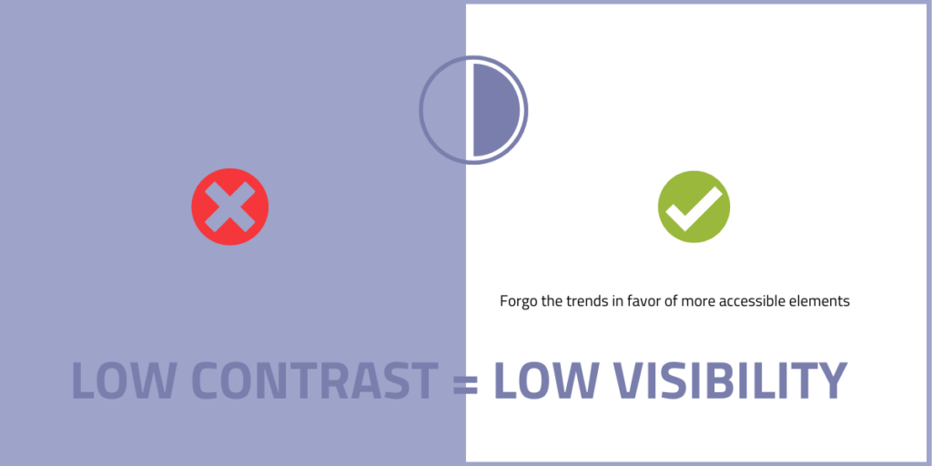
While low-contrast visuals such as light gray text on a white background have been trendy, that can interfere with the visibility of your site content. There’s a recommendation that there should be at least 3:1 for buttons or 4.5:1 for small text.

Build big buttons
There should be enough space on a button to press it easily using a finger on a mobile device. This also helps if the device is being used with a joystick or other controller, because it could be difficult to hit small targets with them.
Pay attention to how it opens and closes
In another variation on the search bar, the search bar is hidden by default until it is made visible by clicking the magnifying glass icon. Then the keyboard focus moves to the input field.
Hidden elements: An important thing to consider is that if you visually hide an element like the search bar from the site, it needs to be hidden from assistive technology as well. It may sound like a good idea to let it be usable by keyboards or screen readers even when it’s not visible. Unfortunately, if you do this, when you’re operating the site with a keyboard and moving from one element to another, the focus style suddenly disappears because it’s on the hidden element. That can be very disorienting. It can also be confusing for screen readers to be able to access content that should not be available at the time.
So, if you hide something, hide it from assistive technology too. Conversely, if you’re showing or unhiding an element, make sure that it’s showing for the assistive tech as well. The technique used to hide the element matters, since if you use opacity to hide it, it will only be hidden visually, while a command like ‘visibility: none’ or ‘display: none’ will hide it from both.
Moving focus: When something new is opened on the page, the keyboard focus should move to the opening element. When opening an element like a search field or a button or a link, the element should be like directly under the activating button without other unrelated elements between the initiating button and the newly opened field.
Closing easily: It’s also important that the element can be closed easily. It’s good to have a button that closes it, but it’s also good to make it so that the element closes if you press the Esc key or if you click elsewhere on the page.

In the example above, the focus shifts to the search bar when it is opened which is a key aspect of accessible site search. It also has a button that closes the search bar. However, note how the user has to navigate through multiple menu options to get to the close button from the search bar. This adds several steps for a user who wants to close the search bar. Fortunately this website also has the option of using the Esc key to close the search function.
Attributes marking button relationship to elements: The activating button should have attributes that indicate that this button controls the visibility of this other element. There are ARIA (Accessible Risch Internet Applications) attributes that you can use for that (aria-expanded, aria-controls).
2. Making search results accessible
Once the search bar has been made accessible, the search results are the obvious next step.
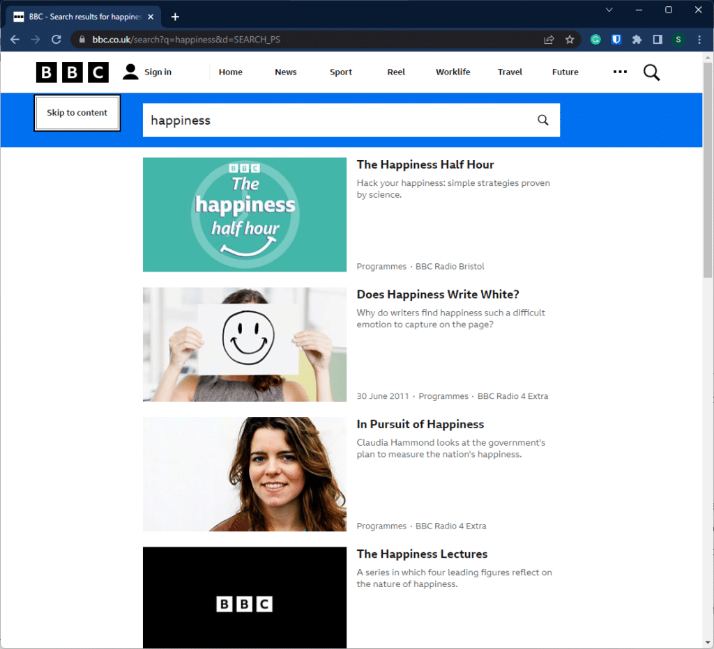
Show the search phrase in the page title and heading
This shows users that they are on the results page and clearly indicates what the subject of the search was.
Include a ‘skip to content’ button
This button allows keyboard users to avoid having to go all the way through the navigation menus and banners to get to the search results. They can just activate the ‘skip to content’ button and it will take them to the main content of the page. It can be set to be visible only when there is a keyboard focus, instead of being visible all the time.
Locate the search form close to the results
When the search form is close to the results, users can easily enter several different keywords without needing to locate the search bar again by way of the header. Using the keyboard to move all the way back to the header to initiate a new search would cause added difficulty for users as it would involve navigating past several links to get back to the search bar.

3. Testing accessible search suggestions
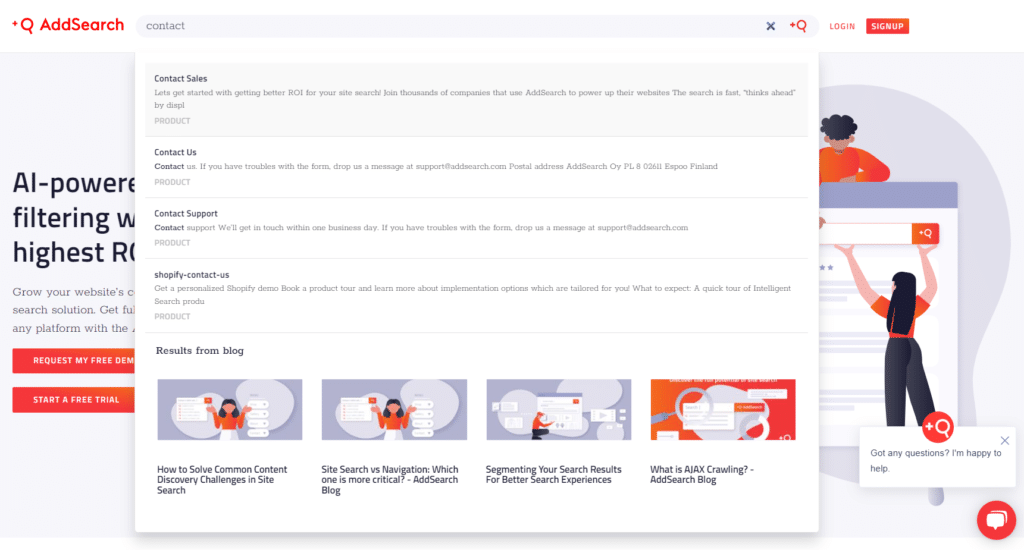
Usually, trying different search phrases requires the user to keep loading the page, which can be time-consuming. A common way to make this process easier is having the search results show instantly below the search field while the user types. This gives the user quick access to the results without having to load the page again, allowing them to change their search keywords easily.
It is quite a complex element, however, and there are potential accessibility issues to consider and test for. It is recommended that someone with appropriate experience tests the element so that you can make sure it works well with keyboards and screen readers and other types of assistive tech. Some of the issues to check for are:
Are the results operable using keyboards and perceivable with screen readers?
When something is typed in the search field and the content on the page changes, the changes should be communicated to the screen reader. Otherwise, screen reader users would not know that something has changed and might wonder whether something happened, and what they should do, including whether they need to press another button to get results.
One way around this is to have visible or invisible text on the page that shows the number of results. When this is wrapped in a live region element, the screen reader will announce the element every time the content in that element changes. The entire search suggestions section should not be wrapped, but only the element describing the change.
Keyboard users can navigate the list of links by using the tab key, moving from one element to another, and then pressing Enter to access the page. A somewhat more advanced and complex method would allow the user to browse the content using the arrow keys. This needs to be tested to ensure it works as intended for the keyboard as well as the screen reader.

Is the focus order logical?
The results should be placed just after the search field, especially if users will be navigating using the tab key. The way the focus moves should not be confusing for users.
Can the suggestions be easily closed?
A close button, the Esc key, or clicking outside the area should close the suggestions.
The accessible site search checklist & WCAG criteria
The factors considered here relate to some of the Web Content Accessibility Guidelines (WCAG) criteria. WCAG offers a standardized list of criteria, commonly used in digital accessibility laws, that you can validate your accessible site search against. It is good to familiarize yourself with the guidelines in case you need to be WCAG-compliant. The website for the guidelines contains a lot of information, such as the purpose of each criterion and how to comply with them.
Here’s a brief checklist for when you develop your accessible site search:
- Search is in a consistent location (3.2.3 Consistent Navigation )
- Contrast ratios are good ( 1.4.3. Contrast (minimum), 1.4.11 Non-text Contrast)
- Icons have text alternatives (1.1.1. Non-text content)
- Input has a label (3.3.2 Labels or Instructions)
- Semantic HTML elements are used (1.3.1 Info and Relationships)
- Search & results are operable with a keyboard (2.1. Keyboard Accessible)
- Changes in results are announced by a screen reader (4.1.3. Status Messages)
- Active selection is perceivable with a screen reader (4.1.2 Name, Role, Value)

Resources & references
General resources
- WebAIM color contrast checker to evaluate your contrast
- Wave browser tool to find accessibility issues
- Monsido for evaluation of accessibility or SEO
- SiteImprove to benchmark against industry standards
Resources for developers
- Announcing content changes with a live region
- Indicating content visibility state with aria-expanded
- Combobox pattern for application-like search suggestions
Applying accessibility guidelines
The stringent regulations and complex, comprehensive guidelines can be overwhelming, especially when your business’s reputation with regulatory bodies is on the line. At AddSearch, our expertise in navigating the changing landscape of search and more importantly, accessible site search, offers an in-depth understanding of the requirements and how to meet them.
Let us help you provide all your customers with the accessible experience they deserve; our team is standing by.


