We all know the frustration we feel when we encounter a broken link. It feels like a dead end and can drive you to close your browser and walk away. But we can all agree that a friendly and helpful 404-page design makes the experience a lot more bearable.
The 404 Error Page is one of the most underutilized assets in the arsenal of digital tools available to site owners. If optimized with 404 page best practices, including engaging content, clear text, and thoughtful design, it can greatly contribute to your website’s conversions and help reduce bounce rates.
What is a 404 Page?

A 404 page is delivered to a user who attempts to visit a page on a website that cannot be found at the specified URL.
The 404 error indicates that the server where the page should be located has been contacted, but the page does not exist at that URL at that moment. 404 errors can occur when websites cease to exist, when pages or files are relocated or removed, or when URLs are mistyped.
But how do people end up on 404 error pages? Statistics say that, on average, 45.87% of people encountering 404 error pages come through emails, bookmarks, typos, or direct links. Social networks and referrals are responsible for 30.26% of the audience. Some users can also be redirected to the page by broken links on your website, making up 17.58% of the audience, while the remaining 6.3% come directly from search engine searches. Source: Impact Plus
Why 404 Pages Matter?
Having customers leave your website is not just bad for the user experience, but it also negatively impacts how you organically rank on Google’s search results page. Without a good 404 page, your customers may leave, not knowing what’s wrong or how to get back to functioning pages.
How you rank organically is something that everyone needs to take seriously, irrespective of whether you use paid search or not.
Google’s algorithm influences organic ranking. The algorithm is based, among other things, on tracking user behavior, which implies that a good or bad user experience will impact your organic ranking as long as it is trackable.
This brings us back to the necessity of proper UX/UI design for websites and 404 error pages.
See… Your Google ranking should be fine just as long as you keep your users interested, engaged, and breezing along through your website (this includes even the error pages) the way they anticipate. If you break these basic guidelines, your favorite search engine will make you pay for it.
Many major websites realize this and go the extra mile to design and customize their respective 404 pages to reflect the website thematically, keep users engaged, and provide a handy safety line to guide them back to the site’s up-and-running content.
What Should a 404 Page Include?
Now that you understand how a fantastic 404 error page may improve both your visitor’s user experience and your website’s SEO rating, it’s time to design the ideal 404 error page. Let’s transform this potentially bad experience into a positive one by directing your users back to your gorgeous website and the appropriate material they were looking for! Here’s a handy list of must-haves on your custom 404 page.
Search Bar
Most believe that adding a search bar to the website’s main page is good enough. They often overlook the importance and value of making a search bar available on a website’s 404 page.
If a visitor ends up at a dead or non-working link on a website, the availability of a search bar allows them to search for the page they were looking for or perform a search for an alternative page. It enables the user to continue their journey on the website without bouncing out.
Error Message
A good 404 error page should display a creative message instead of just showing the error text. As you’ll see in many examples below, a creatively displayed error message, especially in the theme of your website, helps assure users and can prevent them from bouncing out.
Links
Adding useful links to the page is an excellent way to guide users back to your site’s main content.
Call to Action
Having a Call to Action(CTA) button or message encourages users to take action on your website. An example of a CTA would be a button prompting users to click a link to check out new and fresh content on your website home page or contact the support team.
Should 404 Pages Have Navigation?
Once you have the visuals down and have added a witty error message for your visitors, it is time to consider where you want to lead them.
Good 404 pages offer users multiple navigation options so they can continue their journey on the website without getting stuck on the error page.
If visitors click on a broken link, you can redirect them to the previous page, which is helpful.
It also allows the user to go straight to your home page, providing them with more opportunities to explore your website.
404 Page Best Practices and Examples

It’s become a web design trend for most companies to make 404 pages practical and add their own unique spin on the page design. Let’s look at some examples of this in action.
Airbnb: A Great 404 Page Example
A great example to start is Airbnb’s 404 error page. Here are the things Airbnb has implemented into its 404 page design:
- Animation: Airbnb’s 404 page design shows a girl dropping her ice cream, something that was not supposed to happen. Just like the broken link.
- Useful Links: You can find some useful links on the Airbnb 404 page like Home, Search and Help, to allow you to continue browsing the website without having to go back or worse, bounce out.
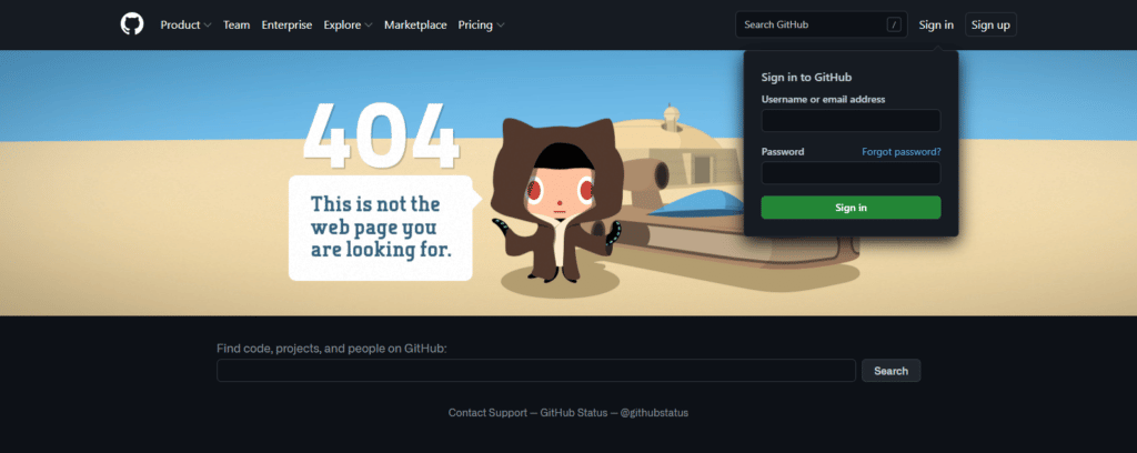
A Unique 404 Page Example from GitHub

Another example of a great 404 page design is Github’s 404 page. Here are the things that make this page work:
- Artwork: GitHub uses an amazing backdrop on its 404 error page, which also includes its mascot.
- Search Bar: The 404 page includes a search bar and uses Search UI best practices in its placement. Search functionality on the 404 page lets users search for new or alternate topics directly from the error page instead of being forced through the extra step of going to the home page first.
- Call To Action: The 404 page has a login menu that encourages users to log in to the website.
- Useful Links: The page has a bunch of useful links in the header for ease of the user.
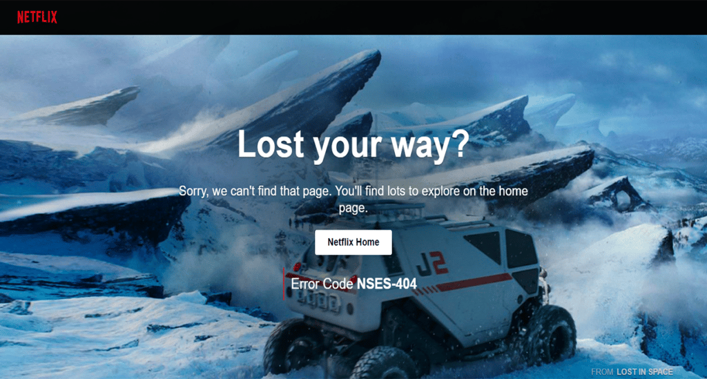
Cinematic 404 Error Page Example from Netflix

Netflix is a popular streaming platform and it also has a custom 404 page design. Here are the things that make Netlix’s 404 page work:
- Artwork: Netflix has an amazing cinematic snapshot in the background of its 404 screens.
- Home Button: Netflix has placed a button that redirects the user to their home page.
Spotify
Spotify also has an amazing custom 404 page design. Here are the things that we liked:
- Animation: Spotify’s 404 page has an animation of a record playing.
- Useful Links: Spotify has effectively used the header of its 404 page by placing many useful links on it.
- Redirect: Spotify has placed a link in the center to redirect the user to the previous page.
Conclusion
All the points made in this article make it clear that the 404 error page of your website should not go under your radar. Companies should dedicate the time and effort to personalize their 404 error pages.
It’s just as vital as the rest of the website’s pages. When properly designed and deployed, a 404 error page can help keep your website’s bounce rate low while maintaining a healthy organic search ranking.
What is a 404 Page?
A 404 page is delivered to a user who attempts to visit a website that cannot be found at the specified URL.
Why 404 Pages Matter?
When encountered, if the 404 page can not engage and encourage the user to stay on your website, The user will bounce, which can negatively impact your rank on Google’s search results page.
What Should a 404 Page Include?
It should include –
– A search Bar
– An Error Message
– Your Logo
– Links
– A Call to Action
Should 404 Pages Have Navigation?
A good 404 page should offer users multiple options for navigation so they can continue their journey on the website and not get stuck on the error page.
Experience the Best in Search Solutions with AddSearch – Top Rated on SourceForge! Click for Your Free, Personalized Demo Now.


