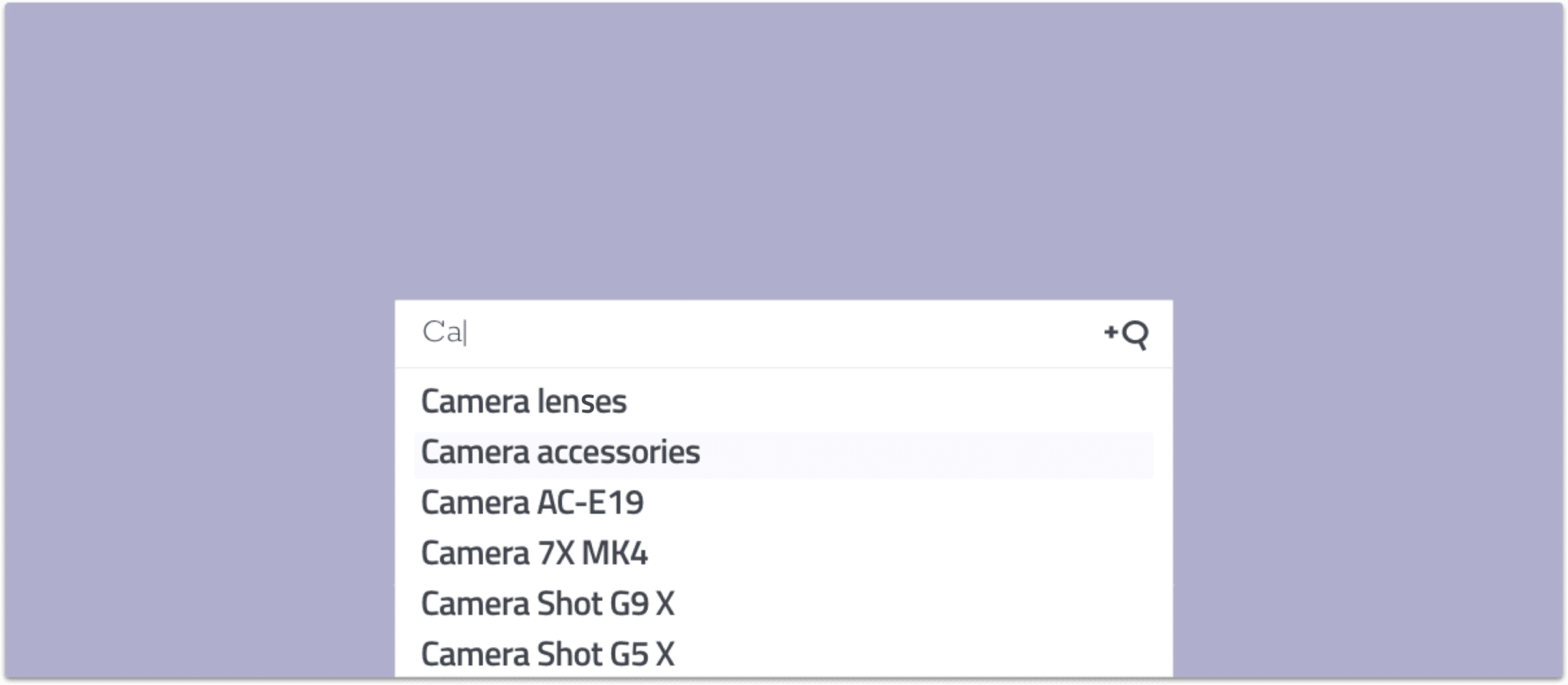
Autocomplete search is a handy tool that you have likely stumbled upon in your daily internet usage. When you start typing into Google, you can see how it offers you suggestions on what you might be looking for. This feature goes by many names, such as “autocomplete,” “predictive search,” and “autosuggest.” It’s a great way to guide, educate, and promote content and products on your internal site search on your website.
Table of Contents
What is Autocomplete Search?
Autocomplete is a pattern used to display query suggestions.
As you type, the search engine will suggest several predictions of how your query could be completed. For example, if you type in “course” on a university webpage, it suggests “courses in English,” “courses in geography,” or “course catalog.” The beauty of autocomplete is that it also fills up unfinished words, so if you type in “lect,” the engine suggests “lecture” or “lecturer.”
Why You Need a Great Predictive Search Feature
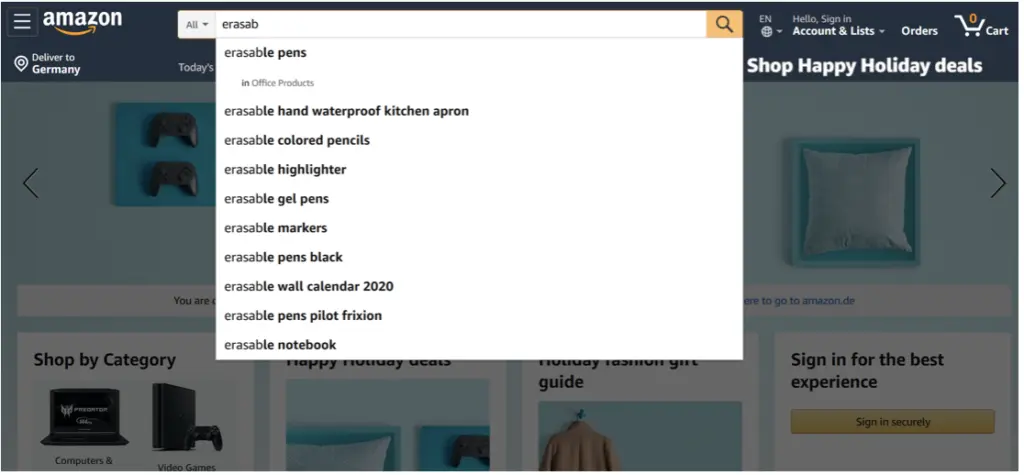
Predictive search might not seem like a necessary feature at first glance, but your search box is the gateway to your content or the products on your website. With autocomplete, you help your users to find the right content faster and with less typing. It also lets them explore options they may not have known were available until suggested.
When done well, predictive search also works as a guide toward your content by providing search suggestions relevant to the site content. It can be a guiding hand for your users to find what they are looking for and offer them help in constructing their search.
Predictive search is especially powerful for mobile devices and for eCommerce marketplaces. No matter if your visitors use mobile or desktop, autocomplete is always a great feature because it saves your users time. On average, autocomplete reduces typing by about 25 percent.
Most users don’t want to type as much on their mobile devices. The screen is limited, and it is harder to type than on a desktop. A predictive search option minimizes the number of characters users have to type which also means that there will be fewer typos. When you use autosuggest on your mobile device it is easier to show suggestions instead of displaying full results already which would take up more space.
If you offer an eCommerce site, predictive search is pretty much a necessity. 82% of the top-grossing e-commerce sites offer autocomplete suggestions to their users as they begin typing their search query. Suggestions help users find the exact words to describe what they are after. Oftentimes, they don’t know the exact product name or are not aware of the different variations of one product.
For example, when looking for a new iPhone 11, the user would discover predictive search results such as “Pro” or “Pro Max,” which inform them about the available product options.
You can also offer some information about your products via autocomplete. You guide the user through your store and set an expectation of what exists. If a product gets suggested, the user will know it’s available.
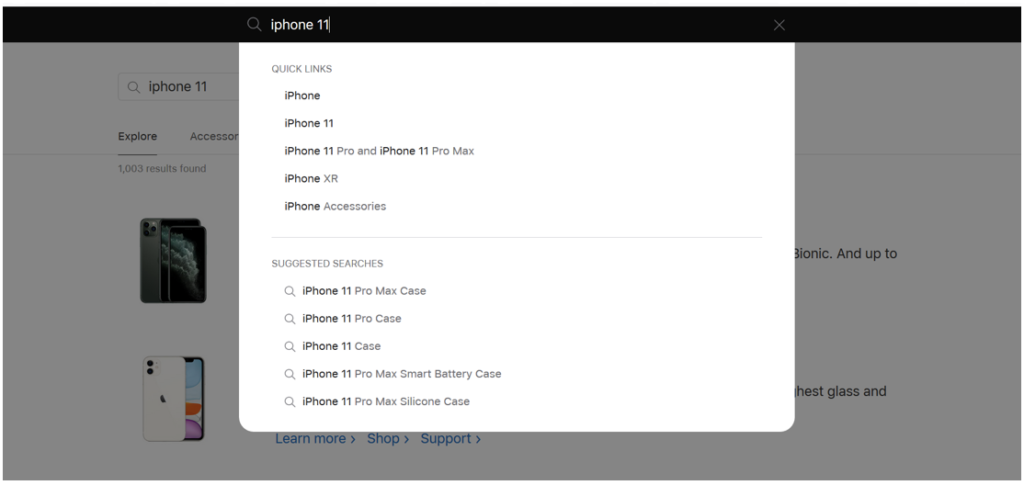
Lastly, you can promote certain products by customizing their autocomplete ranking. You can push certain results to the top of your autocomplete suggestions to catch your visitor’s attention.
How does Autocomplete Work?
To come up with search autosuggestions, your search engine will look at the real searches that are being conducted on your website and discover common and trending ones. The site search will offer keywords relevant to the characters that are entered. The number of predictions should be adjusted depending on the screen. On mobile devices, the predictions should be less to not clutter the view for the user.
Autocomplete suggestions have a psychological effect: they reassure the user when they see matches related to their query and often prompt them to add further details to the query for as long as relevant suggestions keep appearing.
Contact our sales team to explore how to increase conversions, reduce helpdesk costs and make your customers happy.

How Can Autocomplete Help You Find Information?
As mentioned earlier, autocomplete (also known as search autosuggestions) allows you to start typing a word or phrase into a search engine, and relevant suggestions automatically pop up based on popular searches and past search behavior. These suggestions are generated from a combination of your previous search history, trending topics, and what most people are currently searching for. Autocomplete can be a powerful tool to guide your content discovery and refine your search, ensuring you find the information you’re seeking more efficiently.
Let’s dive into how this works and some examples:
- Speeding Up Content Research
One of the most immediate ways autocomplete helps is by speeding up the research process. For example, if you are writing an article about deep-sea creatures, you might start typing “deep sea” into a search engine. Autocomplete could suggest “deep sea creatures,” “deep sea fish,” or “deep sea whales,” quickly helping you narrow down your search without needing to think through every possible search term. You can select one of these suggestions and continue your research with much more precision.
- Discovering Relevant Subtopics
Autocomplete can also help you discover important subtopics that you may not have considered when beginning your search. For example, if you’re writing a blog post on “how broccoli benefits your health,” typing “broccoli” into the search engine might suggest results about “how to cook broccoli,” “how to buy broccoli,” or “growing broccoli.” While these suggestions may not be directly related to health, they can help you discover more specific terms like “broccoli nutrition” or “broccoli health benefits,” which are more aligned with your research topic. These suggestions are based on what other people are frequently searching for, helping guide you toward more useful and precise information.
- Refining Search Intent
Sometimes, your initial search query may be too broad or vague. Autocomplete can refine your search intent by suggesting more specific phrases. For instance, if you start typing “benefits of exercise,” autocomplete might suggest “benefits of exercise for mental health” or “benefits of exercise for weight loss.” This allows you to fine-tune your search to match your exact research needs, whether you’re looking for health, fitness, or psychological benefits.
- Uncovering Commonly Searched Questions
Autocomplete is also excellent for uncovering questions that others commonly ask, which can be invaluable for content creation. For example, if you type “how to start a garden,” autocomplete may suggest questions like “how to start a garden from scratch” or “how to start a garden indoors.” This can be a huge help if you’re looking to write content that answers frequently asked questions or to explore areas of interest that your audience is likely searching for.
- Helping with Long-Tail Keywords
When doing research for blog posts, SEO content, or even academic writing, autocomplete can provide you with long-tail keyword suggestions that might be otherwise difficult to think of. For instance, if you search for “best smartphones,” autocomplete might suggest long-tail variations such as “best smartphones for photography” or “best smartphones under $500.” These long-tail keywords are incredibly valuable because they target more specific audiences and can help your content be discovered by readers looking for niche information.
- Identifying Regional and Local Variations
Autocomplete is not just based on global searches—it can reflect regional or local search trends as well. For example, if you type “best pizza places,” autocomplete might suggest “best pizza places in New York,” “best pizza places in Chicago,” or even “best vegan pizza places.” This local customization makes autocomplete an excellent tool for finding region-specific content, whether you’re looking for local businesses, cultural references, or regional advice.
Examples of Autocomplete in Action:
- General Research: If you’re researching “climate change,” autocomplete might suggest variations like “climate change effects on agriculture” or “climate change solutions,” helping you zero in on the most relevant aspects of the topic.
- Travel Planning: When looking for vacation ideas, typing “vacation spots” could bring up suggestions like “vacation spots in the Caribbean” or “vacation spots for families,” allowing you to refine your search for specific types of getaways.
- Product Research: If you’re considering purchasing a new laptop, typing “laptop for gaming” into the search bar might suggest “best laptops for gaming under $1000” or “laptops for gaming and video editing,” making it easier to find the best match for your needs.
Also Check:
AddSearch Recommend Feature For Travel Websites
By showing you the most relevant and popular search terms, autocomplete not only helps you find information faster but also aids in discovering new topics, narrowing down your focus, and uncovering ideas you might have missed. It’s an essential tool for both casual searches and in-depth content research, making it easier to stay informed and find exactly what you’re looking for.
8 Best Practices for Autocomplete Search
Search software that offers autocomplete is, by definition, interactive and highly transient. It should offer user assistance instead of being the sole focus. An autocomplete widget should always be kept simple and adhere to standards that the user knows. The experience should be as self-evident and seamless as possible for the visitor.
You want to help your users better articulate their search query, guide them through the site, and educate them about content. Unfortunately, if an autocomplete widget is designed badly, it might distract the user during their search or even mislead them.
That is why we collected 8 best practices for autocomplete:
1) Ranking and Relevancy
You can only show a few suggestions for on-site search, which makes the ranking vital. All suggestions need to be relevant to the user. You can analyze what is popular or trending as a query to find out which content most users search for. Of course, this is a bit tricky when you only have very few search queries.
2) Speed
Autocomplete should always be on as-you-type speed. Anything that feels slow to the visitor will be a disrupter to the user experience. After all, it’s best if the user does not even think about using the autosuggest but just intuitively clicks on it. Suggestions should always start with the first character. The user won’t expect to find any right suggestions already, but you show them that there is an autocomplete feature to support them.
3) Highlight and Style Conclusively
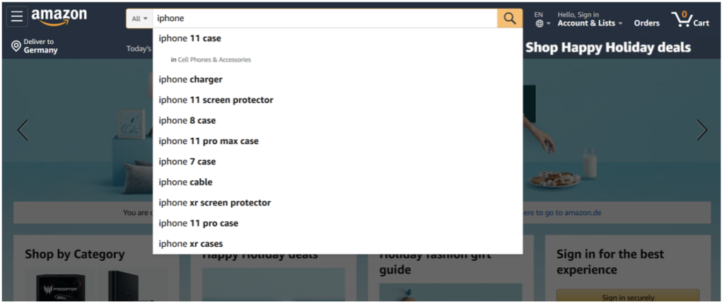
You can help your users by highlighting which results match their request. Often, you will find site searches highlighting the search query the user has typed thus far in the autocomplete suggestions. For instance, when you type “iPhone”, the auto-suggestions would show “new iPhone”, “iPhone 7”, “iPhone case”.
But in fact, the opposite approach works a lot more smoothly. When you highlight the part that is being suggested, you help your user distinguishing between suggestions since it focuses on the differences. Your user will be well aware of what they entered, so they will be interested in the additions. For instance, if you type in “iPhone”, your auto-suggestions would look like this: “new iPhone”, “iPhone 7”, “iPhone case”.
Users who access your products or content via mobile will appreciate a conclusive highlighting and styling of elements. Any additional information such as information about the department you are searching in or the filters that are available, should have a unique style (see below “in Cell Phones and Accessories”).
4) Keep it simple
You want to avoid scroll bars in your autocomplete search. No one wants to scroll within an interactive widget, instead, the widget should just expand to its natural size. That is why the size of suggestions should be kept at a maximum of 10 items to avoid choice paralysis. You want the users to easily get an overview of their choices.
When the suggestions exceed the 10 items limit your users will either ignore the suggestions altogether or spend a long time reading them which will slow down the searching process. On mobile, the list should even be shorter with a target of 4-8 suggestions.
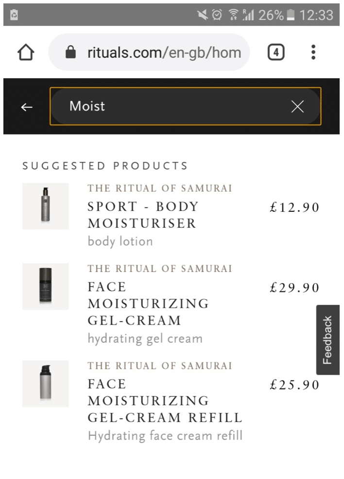
5) Use Labels and Instructions
For less experienced web users it is great to include instructions on how to interact with the autocomplete feature. Headings like “search suggestions” or “categories” offers a way for the user to distinguish the different suggestions types instead of mixing them all into one list.
6) Support keyboard navigation and mouse interaction
Your user should be able to use their keyboard navigation to click up and down through the autocomplete suggestions. Also, it’s recommended to show that the autocomplete suggestions are clickable with a mouse, for instance by invoking a hand cursor or by highlighting what the user would click. Hovering, on the other hand, should be a non-committing action and not directly send to results.
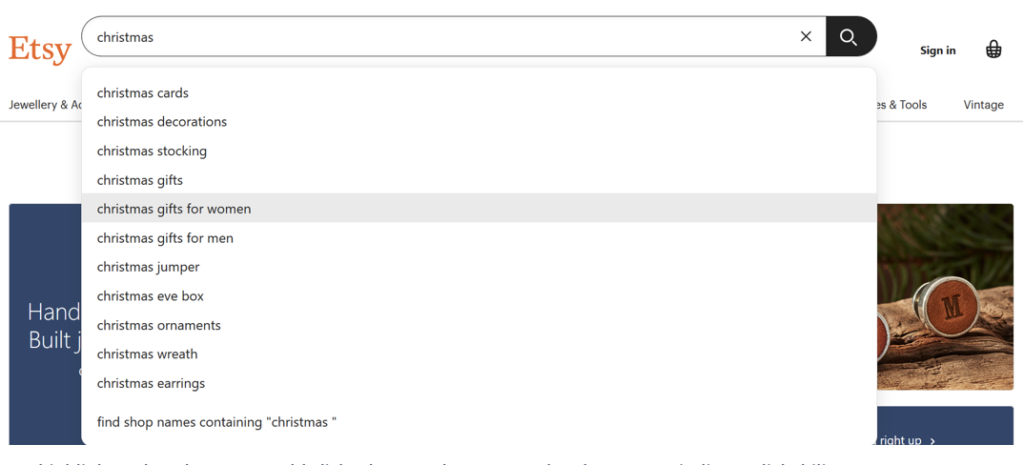
7) Design Visual Depth for Autocomplete
When the user opens a website, there are many elements of the page that fight for its attention. Darkening the page background while autocomplete search is used, offers a clear focus and strong emphasis. Your user won’t get distracted by other info on the website and can concentrate on the autocomplete suggestions.
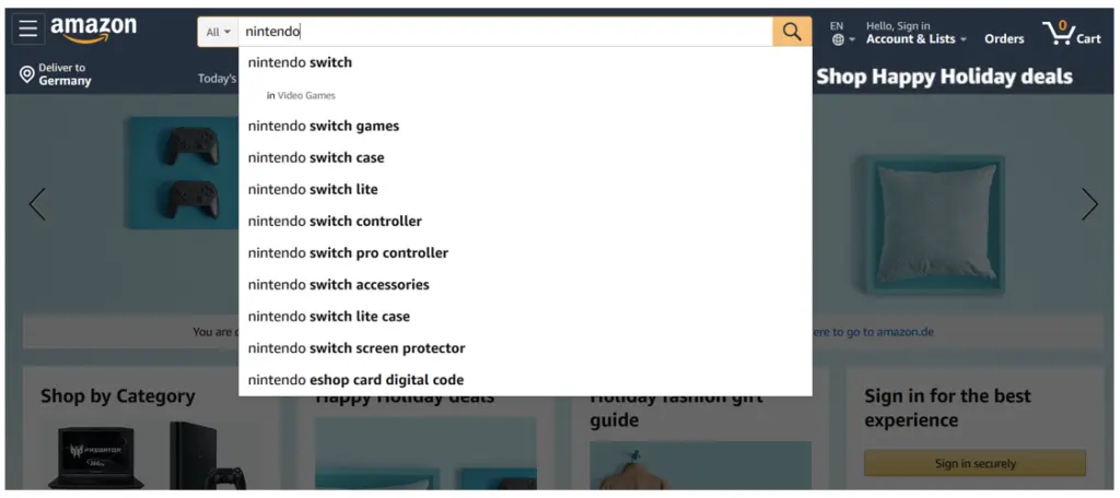
8) Personalize your Autocomplete
If you offer a personalized site search, you can offer results based on the current location of the visitor or based on their primary language. In addition, you can show their search history and similar or relevant search terms to make them interested in your content.
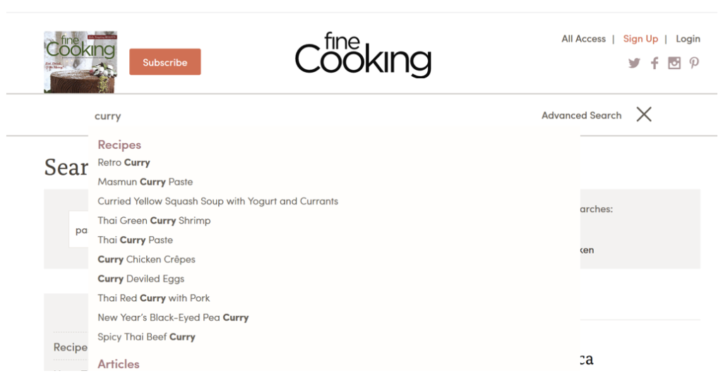
How to implement Autocomplete?
There are several ways to implement autocomplete on your website.
One easy way to implement autocomplete is using the AddSearch widget. It offers automatic search suggestions generated from search queries made on your website. The more data is collected, the more the number and quality of suggestions will increase.
With the support of a developer, you can integrate it with an API. You will be able to customize the design and user interface as much as you want to.
AddSearch offers features such as customization to customize fields for product names or a blacklist to remove suggestions by blacklisting them.
Autocomplete is a feature that makes it faster to complete searches. As you type a search query, the search engine will suggest several predictions of how your query could be completed.
Automated systems generate predictions based on previous user search queries, helping people save time by allowing them to quickly complete the search they intended to do.
