The internal site search feature is more than a search and discovery solution. Besides helping your users find what they are looking for quickly and accurately, it can give your business valuable insight into what your users seek, what’s missing from your product or services, and how to optimize your product categories and namings.
But what makes a great site search user interface (UI) design? Is it its design, size, feature, placement, or other factors? We will tell you how to create an optimized site search screen UI design, the dos and don’ts, plus some site search UI design examples to inspire you.
Why Search UI Design is Important?
Your site search can have a significant impact on your users’ satisfaction with your brand and services. The faster and the more accurate the results are, the happier your users are. But, the quality of the results isn’t just the determining factor here. The look and feel of your site search box can leave deep impressions on your users as well.
For example, if they can’t find the search box in the first place or it isn’t responding, users may abandon your site frustratingly. Therefore, it is not surprising that your search’s user interface design plays a vital role in the overall success of your website.
Now, let’s take a closer look at how you can build a great search results UI for your website that will give your visitors a pleasant experience.
How to Build an Excellent Site Search Screen UI Design
Step 1: Plan and Ask the Right Questions for Your Search Screen UI Design
As always, we recommend that you start with a proper and thorough planning phase before you begin designing your search results UI. In most cases, you don’t have to rush things, and adequate analysis and planning can save you a lot of time in the long run.
The most essential task in this phase is to ask the right questions. What is the problem? What are you trying to solve? If you don’t know the issue you want to address, you probably won’t find out whether the end result will benefit you and your users. So get your team on board and invest time in planning and developing your website search vision.
At this stage, it can be helpful to look at other websites that have a use case similar to yours to get inspiration. Keep in mind, though, that different content types require different solutions. For example, an e-commerce search must offer functions other than those in a food blog. The same applies to the UI and the UX, which have to fit the overall context for different websites and use cases. Ultimately, don’t fall into the trap of thinking what works for others will work for your website. Gather inspiration to generate new ideas and plan a site search that fits your specific use case.
Contact our sales team to explore how to increase conversions, reduce helpdesk costs and make your customers happy.

Step 2: Assess and Validate Your Product Data
Under the hood, site search is a program that – at the very least – takes user input, compares it with your website content, and returns relevant search results for the given query. Although users can’t see what’s going on, they know when they’re not getting the best results. If parts of your website’s content can’t be read and processed by the search tool used, you won’t be able to deliver valuable search results. Consequently, your visitors’ experience with your website and brand may deteriorate.
Therefore, validating and optimizing your website’s content and content structure is a must. Take a look at the different types of content you offer and what search functions users need to find these content pieces quickly and easily. Take the ideas you generated during the planning phase and check whether you can realize them with your current setup.
AddSearch tip:Most companies follow well-thought-out marketing and SEO practices. If you already have a list of popular SEO keywords, which you also include in your content, make sure to use them for your site search as well. For example, you could offer a search suggestion box with keywords that your users search for frequently. Keep in mind that you can often reuse data and analysis results to optimize your search.
Step 3: Build the Wireframe of Your Site Search UI Design
Now, it’s time to gather all of your knowledge and create the wireframes for your site search. At AddSearch, we use graphical elements from our Search UI library and combine the different views and functions it already provides. Regardless of how you create your wireframes, you should take the opportunity to experiment with different layouts and UI elements. First, cut everything down to the bare minimum and focus on building a solid foundation for your site search. You can then add additional features and functions step by step. This ensures that your search doesn’t end up being overloaded with unnecessary features.
The image below shows what wireframes for site search could look like.
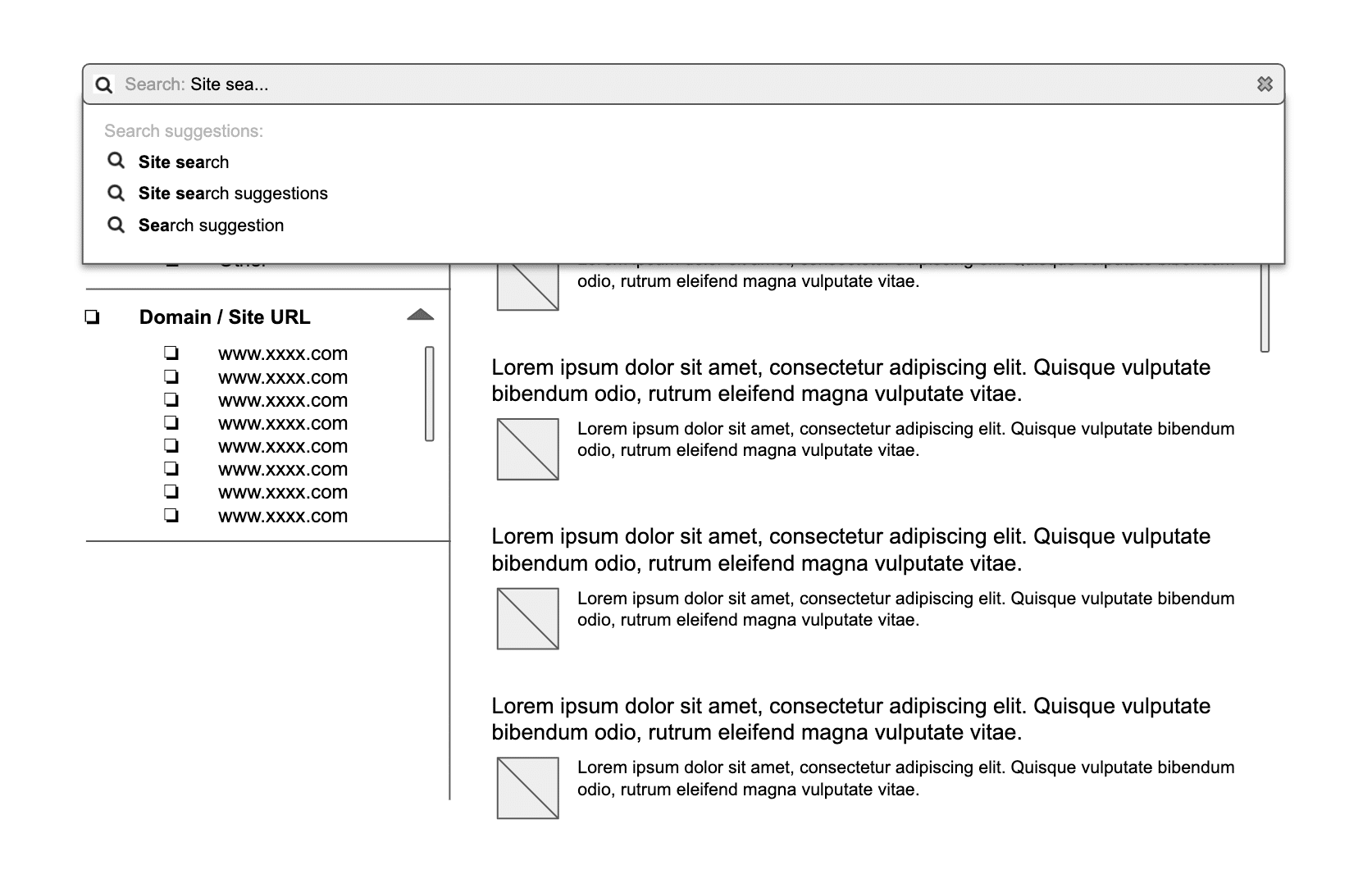
Review your wireframes regularly and make further adjustments until the outcome meets your requirements. These iterations can take a few weeks but are well worth the effort. If you only review and adjust your site search after it has already been programmed, changes will no longer be easy to implement.
AddSearch tip:In most cases, you don’t need to build a search UI that blows your users’ minds. As one of our designers puts it: you know you offer a good website search if no one remembers it. This is because, unfortunately, we often remember our bad experiences better than the good ones. Also, don’t put yourself under pressure to reinvent the wheel. You can always use templates or our Search UI library, which already offers many features and UI elements out of the box and adapt them to your use case.
3 Best Practices for Creating the Wireframe of Your Site Search
1. Use Well-known Patterns and Effective Copy
Many websites use a magnifying glass icon for their search instead of using the word “Search” itself. Other sites follow a more traditional approach, providing their visitors with a submit button, including copy. Both options are fine since the right choice depends on your business, target audience, and website design. Below’s example from Bottomline shows a site search that incorporates both ideas:

For example, an older audience may prefer the submit button variant. At the same time, younger people have no problem finding their way around in modern approaches. Naturally, you can’t say for sure what works for your visitors without analyzing their behavior. If you can’t choose between these two options, you can also implement both and then conduct A/B tests to determine which works best.
AddSearch tip:Note that when using symbols, it’s advisable to use the magnifying glass as your users may not associate other icons with search. Likewise, if you opt for copy, make sure it’s straightforward and use words like “Search” or “Find”, even if this sounds boring to you.
2. Offer Autocomplete
Thanks to Google, most of us are used to typing a few letters in a search bar and then getting suggestions for our search. We don’t have to enter every single letter ourselves and can quickly find the information we need. So when you add autocomplete to your site search, your users will feel right at home.

Naturally, you need an apt search tool with which you can offer autocomplete. For example, if you use your CMS’s default search, it probably doesn’t have the capabilities you need.
3. Offer Filters and Sorting
When you have many different content types or products, it makes sense to provide users with filters and sorting functions to fine-tune their search. Usually, you only display these elements when users are already on the search results page. Here, they have the opportunity to fully seize the search’s features without feeling overwhelmed or distracted. Below, you can see some of the filters offered to search for courses at Robert Gordon University:

5 Tips on Designing and Building Your Internal Site Search UI
After you have completed the wireframe to your satisfaction, the search’s design and implementation should be straightforward.
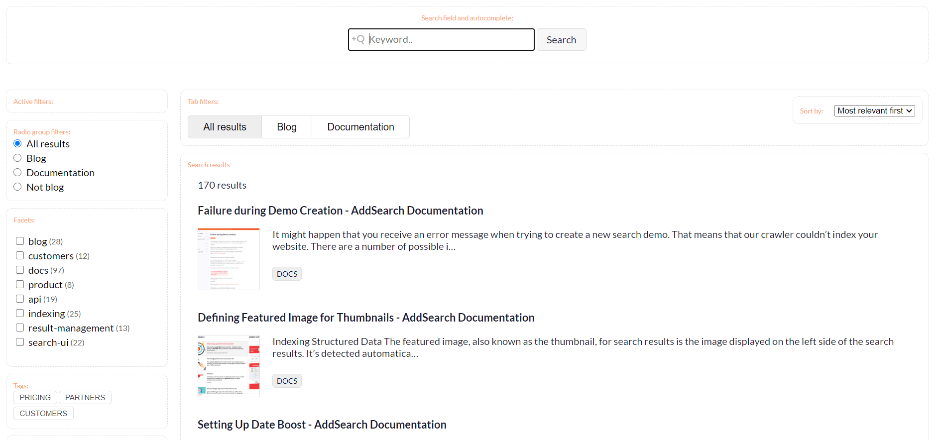
As an AddSearch user, you can use our ready-made views or our Search UI library to build your search’s UI. While the first option offers limited customization options, you can use our UI library to create a user interface that fits your company and website perfectly. One of the library’s benefits is that designers and developers can work together quite effectively because they use the same foundation. You can see this library in action on our demo page and in the picture below.
1. Start with Designing the Mobile Search UI
Many designers (including ours) start by first designing the mobile search experience. This is because some design ideas don’t work on mobile phones or are harder to implement. Even though smartphones are an integral part of our daily lives, many still forget to check how websites work and look there. Sometimes, it seems like we only remember the existence of smartphones and tablets in the last minute of the implementation phase – when it is often too late. Design teams around the world take different approaches to mobile design, and your process can be completely different from ours – there’s probably no right or wrong here. Just make sure you don’t forget your mobile users!
Below, you can see the mobile site search design on vaadin.com.
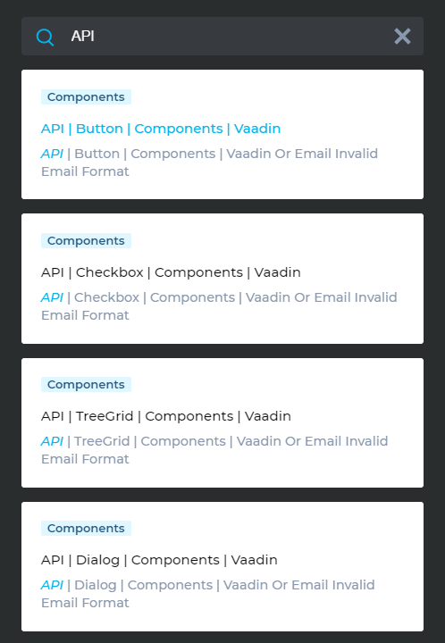
2. Make Your Search Accessible
Another aspect that is easily overlooked is accessibility. Naturally, your site search (and the rest of your website) must be designed and built to be accessible to people with impairments. Depending on the country in which you operate, you may need to adhere to specific accessibility standards. So, there are at least two good reasons why you should care about the topic.
Think about how users can successfully use your search with screen readers and other assistive technologies. Don’t forget to test your search’s accessibility – also on mobile devices!
3. Position Your Search Bar Where Users Expect It
If you are not going to make your search an eye-catching element of your website, place it where your users expect it to be. Typically, you can find search bars in the upper section of a website. If you have a navigation bar at the top, it’s usually a good idea to place it there. Another popular location for site search is the sidebar. Wherever you put your search bar, make sure to stay consistent so your users can find it easily on every page.
If you have an e-commerce site, you may want users to spot your search bar immediately. Amazon, for example, has a wide and easily recognizable search at the top of its page.

4. Work with Synonyms and Typos
Your users may not use the expected terms when searching for content on your website, or they may simply misspell words. Of course, you always want your users to get results for their searches, whether they’re looking for pricing, prices, or fees. It makes a big difference for you and your users if your search tool supports working with synonyms and misspellings. However, this requires that you take action yourself and regularly add synonyms and typos to your site search solution. The more effort you put into this, the better your search results will be.
5. Show Relevant Content First
Advanced search tools let you add or remove “weight” from specific pages or sections of your website. In this way, you can ensure that less critical content is not displayed high up in the search results and vice versa. Another possibility is to promote your business-critical pages so your visitors can find them with ease.
Of course, there are many other methods you can use. In this UXPin blog post, you will find an excellent selection of common UX design methods and techniques.
3 Search UI Design Examples and Best Practices in Action
Site Search UI Example 1: Robert Gordon University

Robert Gordon University recognized that users needed to find course information fast; with that in mind, they implemented a course-specific search bar that is boldly placed and easily visible on the homepage.
Site Search UI Example 2: Barracuda
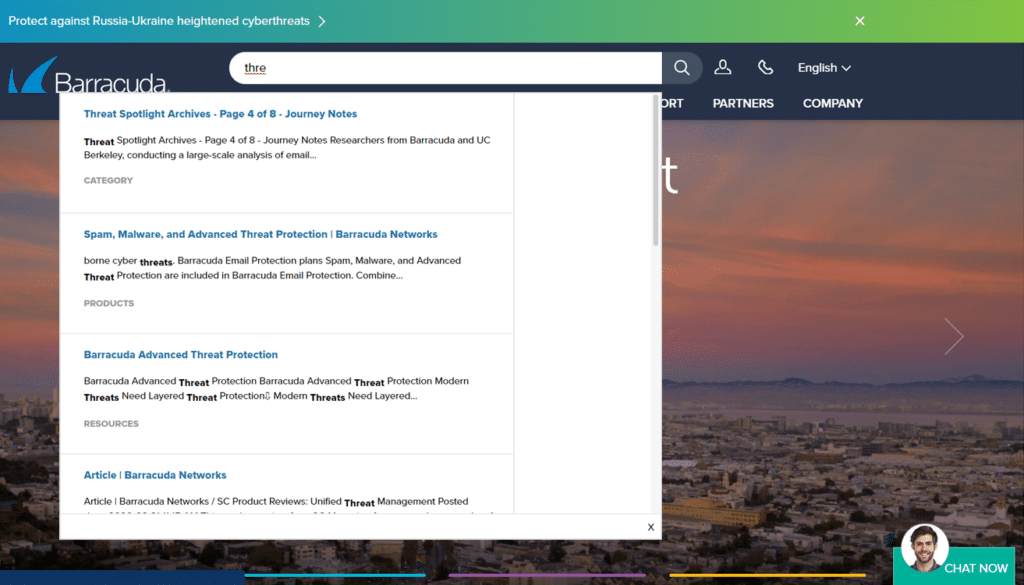
Barracuda Networks offers an intuitive “search as you type” search experience that speeds up and helps users with content discoverability
Site Search UI Example 3: European Broadcasting Union (EBU)
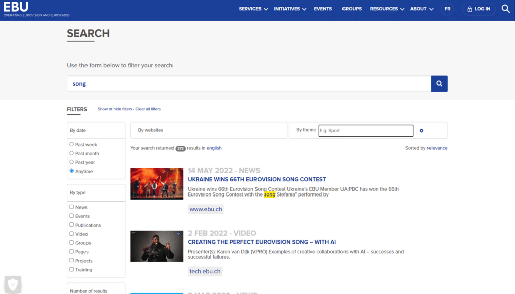
The European Broadcasting Union (EBU) website’s search page has multiple filters, and users can filter the results based on website, publishing date, type, and theme. EBU’s solution makes it easy for their website visitors to find exactly what they are looking for from any of EBU’s websites.
Monitor and Optimize Your Site Search
After you’ve released your new site search to the public, it is time to monitor how your site search performs in reality. You will most likely discover new aspects of your users’ behaviors and will need to tweak the search’s UI a little. Ultimately, monitoring and improving your site search should become a habit – just like SEO analysis and optimization. Read our blog post on this topic to get started quickly!
Working with Different UX and Design Practices
So far, we haven’t talked about the various UX and design methods you can use to help build a great search UI. These methods can be instrumental if you work on a website redesign or if your website is heavily dependent on your site search, as in e-commerce.
In our experience, there is no one-size-fits-all solution. The entire process of building the search UI has to be adapted to your individual use case, your company, and your users. Therefore, it is often not necessary to use advanced design methods to create an excellent search interface. However, we would like to give you some ideas about which techniques you could use if you feel stuck during the design process:
- Personas help you understand the needs of your users and customers.
- Customer journey maps visualize your users’ journey and their experiences before, while, and after a search.
- User flows let you see the big picture, where website search can take your users, and whether you can simplify the process.
- Prototypes give you a more realistic view and experience of the search, which can be handy for extraordinarily complex and innovative site searches.
- Usability tests let you discover how actual customers are using your site search and improve the service accordingly.
- A/B tests present website visitors with different site search versions so you can find out which variant works best.
A/B Testing for Search UI Design Improvements
A/B testing to find better search UI changes is a strong way to improve the user experience and make site search features work better. With this method, you make two versions of a search screen, called Version A (the control) and Version B (the variant), and show them to different groups of people. Designers can learn a lot about which parts of their designs users like best by keeping track of how each version does in terms of measures like click-through rates, user involvement, and conversion rates. With this data-driven approach, teams can make smart choices about what changes to make to make the search experience better.
A/B testing isn’t just about comparing how things look, like button colors or changes to the layout. It’s also about testing how things work, like autocomplete ideas, filtering options, and even the patterns of search results. As an example, a group could find out if people would rather have a search results page with fewer options or one with more. Businesses can make their site search much better by constantly iterating and improving the search UI based on how real users interact with it. This will increase user happiness, engagement, and, ultimately, conversion rates.
Increase User Satisfaction with Great Site Search UI Design
Hopefully, with the knowledge from this blog post, you will be one step closer to building a great search UI.
Ask the right questions, figure out what the ideal site search looks like for your use case, and spend as much time planning as necessary. Then, it will be much easier to create the search wireframes, add the needed features, and create the Search UI design to match your website.
However, creating the right search can be challenging if you lack the right expertise or tools. Contact us to find out how our experts can help you build a great search UI that you and your users will love to use.


