Website owners typically offer a variety of content spread across different areas of their site or even across multiple websites. But the more content types there are, the harder it can be to provide users with a satisfying search experience. Segmenting your search results is a great way to ensure that there is something of value for every visitor. To this end, segmented search displays search results for specific content types in clear, separate sections to present users with a relevant mix of content.
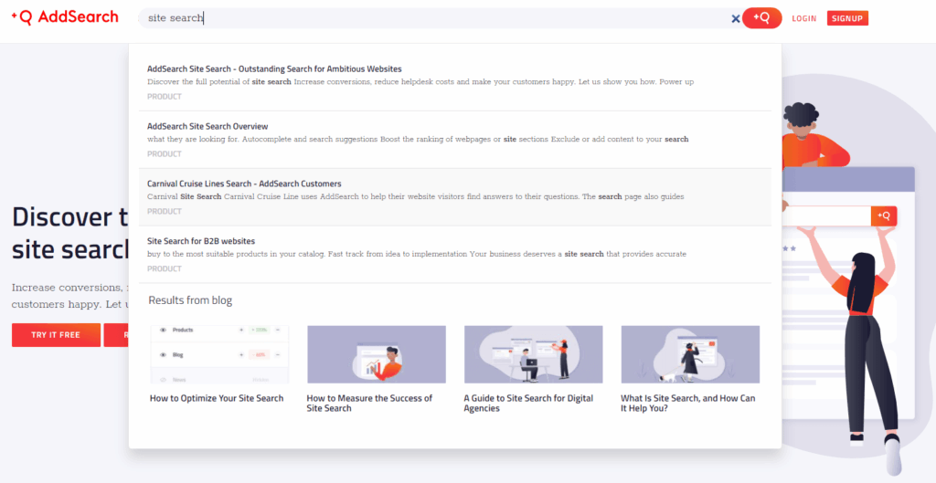
In this blog post, we’ll discuss what segmented search is, what to consider when designing one, and how you can leverage it to provide better user experiences. So without further ado, let’s get into it!
Providing effective site search on content-rich websites can be challenging
Most websites are home to more than one content type. We’re talking about full-page content like products, news articles, or blog posts. But we’re also talking about smaller content pieces such as user reviews, comments, or videos.
Typically, when a user enters a keyword in the website’s search bar, the search displays matching search results in a vertical list:
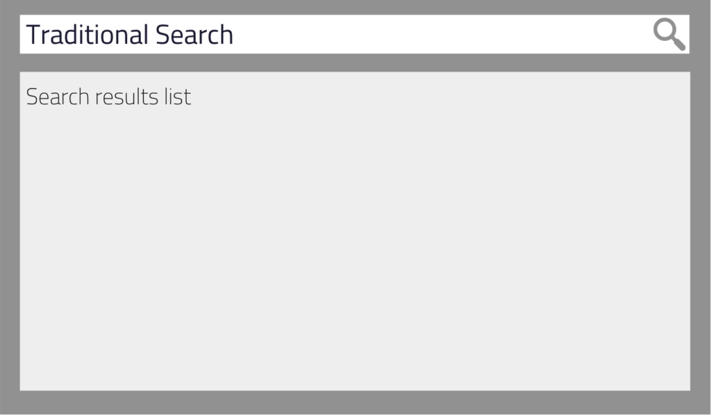
Considering how websites have many different content types and how the search UI usually looks like, a few challenges can arise:
Search delivers one-dimensional results
For the most part, we want a site search solution to return search results from the most important categories or content types first. For instance, as an e-commerce store owner, products are probably more critical to you than blog posts.
However, while you want to boost products in your search to increase sales, you still don’t want users to completely miss out on your blog posts. After all, providing users with a relevant mix of content can improve the customer experience, build trust and ultimately increase sales.
Finding information is tedious
Since site search often focuses on providing content from the most critical website areas, users can find it difficult to get relevant results from other categories.
Suppose a user searches for “horror” in your online bookstore. The search will most likely list books containing the keyword in the title, category, or tag. But what about book genre pages, user reviews, authors, and other content relevant to the search term?
Often, users have to search twice to get the wanted results:
the first time they search, they enter the keyword. If they don’t see the desired information, they start the second search by applying filters and facets.
Of course, we’d all find it better if users got relevant search results after the first search.
Differentiating between search results is a challenge
Mixed search results from different categories and content types can make it hard to spot the desired information – especially when everything looks the same.
Current search UIs often use color codes and text to help differentiate between content types. Yet, while this is a valid approach, the user must first learn these conventions. Naturally, the more times a visitor uses a search, the easier it becomes for them – but what about users who don’t use search regularly? To provide a straightforward search experience to most users, we need a more transparent approach to tell content apart that doesn’t need to be learned.
How can segmented search boost your site search’s user experience?
Segmented search is a great way to master the challenges above. With segmented search, results from specific website areas are displayed in separate sections (segments) for a single search query.
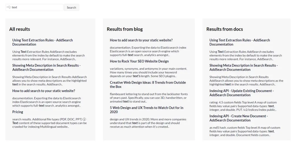
Each segment is a dedicated area containing a list of search results for a particular content type. Instead of one long list of search results, you have two or more lists.
The screenshot below shows an example of a segmented search results UI from our Search UI library. You can also try it out here for yourself.
You can also see segmented search results in action on our website. Here, we use a different layout than in our demo.
First, the search displays a list of search results from our website’s various areas. This list is followed by a dedicated space in which the search displays matching blog posts.
Let’s recall the challenges explored in the previous section and see how you can benefit from segmenting search results in comparison:
Segmented search offers versatile results
The segmented search results UI allows you to create separate areas for specific content types. Consequently, your search can focus on the primary content while also displaying other valuable results simultaneously.
As a result, your users can enjoy a rich search experience that invites them to view other content and explore your website.
Users can find content faster
Do you know your users’ preferred content types? Then give these types their own section in your segmented search results interface. This increases the likelihood that users will find the information they want after their first search without applying filters and facets for a second search.
Search results are distinguishable
Using segments to display search results makes it easier for the human eye to tell content types and categories apart. By combining structural separation (segments) and visual separation (colors and text), you can make information more easily recognizable for users without necessarily having to learn the system behind it.
What do segmented search results look like?
When it comes to designing the segmented search results UI, you have various options to choose from:
Horizontal layout
With this variant, segments are displayed next to each other. Naturally, you need at least two segments to make it differ from conventional search. You can populate each part with search results from different categories or content types, whether or not they are related in any way.
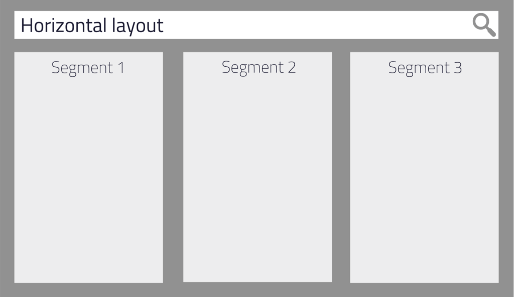
Suppose Segment 1 is more critical than the other two. Then you could size the segments differently to guide the users’ attention to the most vital results list first. Note that this may look cluttered depending on the number of segments. If it’s too much, you’d better choose one of the other layout options.
AddSearch tip:
In theory, there’s no maximum number of segments that you can display horizontally. In reality, though, you need to limit the number to keep the elements accessible without scrolling. Horizontal scrolling is still relatively uncommon, and most users could have trouble with it. Also, keep in mind that you have much less space on mobile devices than on desktops. Therefore, in your responsive design, you will probably have to switch to the vertical layout once you reach a specific screen resolution.
Vertical layout
Next, we take the horizontal design and rotate it 90 degrees to line segments up vertically. This is similar to how traditional search looks, except that we still use segments to visually separate content types in our search.
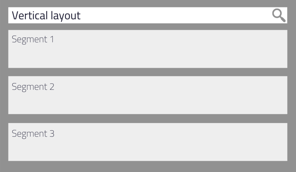
In contrast to the horizontal approach, this layout variant gives you more space to display additional segments. Users are used to scrolling vertically on websites when they realize that there’s more below the visible area. Consequently, you don’t necessarily have to limit your search results area to a particular height, and you can let users scroll through segments and search results.
However, we still recommend keeping the number of segments in check and not overdoing it. Too many segments can be counterproductive and make it difficult for users to find relevant information again.
AddSearch tip:
Design the layout for mobile devices first to ensure that smartphone users have a pleasant experience with segmented search even when their screen resolution is lower!
Combining the horizontal and vertical layout
If neither the horizontal nor vertical design meets your needs, a mix of the two may just be what you’ve been looking for.
For example, combining the two variants can direct the users’ focus to a specific search result segment. You could also visualize content hierarchies: the primary segment gets the largest area, and the least essential segment gets the smallest one.
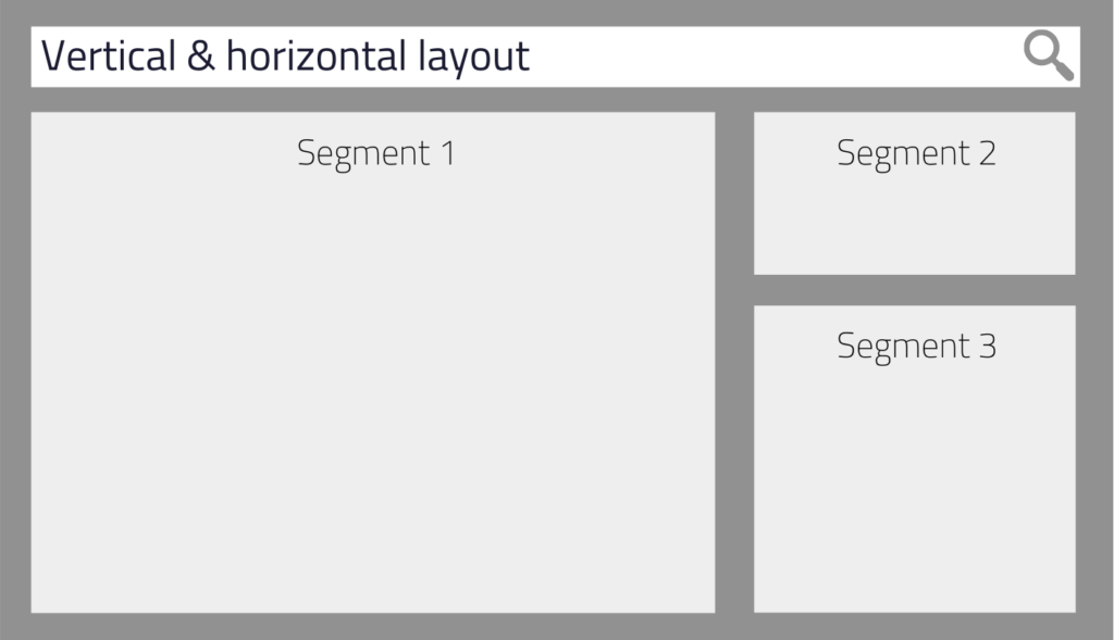
Regardless of how you combine the layouts, try to use space intelligently to quickly help users find the most relevant results. Also, incorporate other design elements used in traditional search UIs so that users can feel right at home.
Find the ideal segmented search results layout for your use case
Now that you know about your layout options, we should also talk about choosing a suitable layout for your use case.
To do this, take a look at the content types you want to display and see if you can rank them by importance. Also, ask yourself how they relate to one another – if they do so at all.
Knowing these things helps you determine the relationships between your search result segments’ content and their matching layouts. Let’s learn more about this!
Parallel information
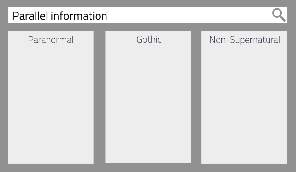
A parallel information organization means that all content types are equally important. They may or may not be related to each other, and they’re often of the same content type but from different categories.
Matching layouts:
Horizontal and vertical layouts work best for listing search results – especially when all segments have the same size.
Example use case:
For example, let’s say there are three popular genres in your online bookstore devoted to horror: Paranormal, Gothic, and Non-Supernatural. Each genre can have its own segment in the search results UI to list books from that genre.
As a result, users are more likely to find “their thing” without using filters to narrow search results to their favorite genres. Besides, they can quickly discover other books that may interest them but are not from their favorite genre.
Complementary information
Segments are complementary when their content types are 1) somehow related and 2) well, they complement each other.
Matching layouts:
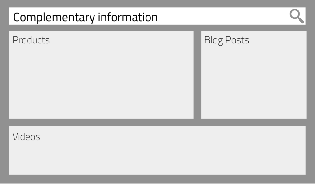
The complementary information organization fits best with a combination of vertical and horizontal segmented search results layouts. Arrange and size segments so that the user can easily spot the main information without missing out on other valuable and complementary content.
Example use case:
Imagine selling furniture online. Naturally, the products are the most critical content type, so you make sure this search results segment looks the most prominent. You also display search results from complementary content such as blog posts and product videos to provide users with a comprehensive search experience.
As a result, customers quickly get acquainted with your content variety and can enjoy a valuable content mix in search. They may not have known that you were posting videos about your products. Or they may discover an interesting blog post that leads them to take a closer look at the associated product.
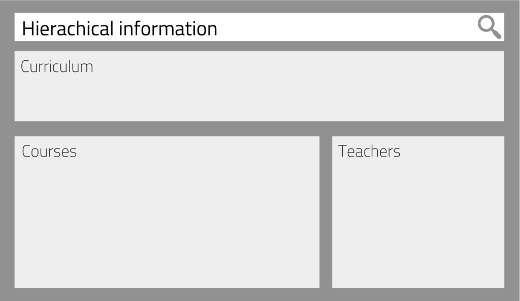
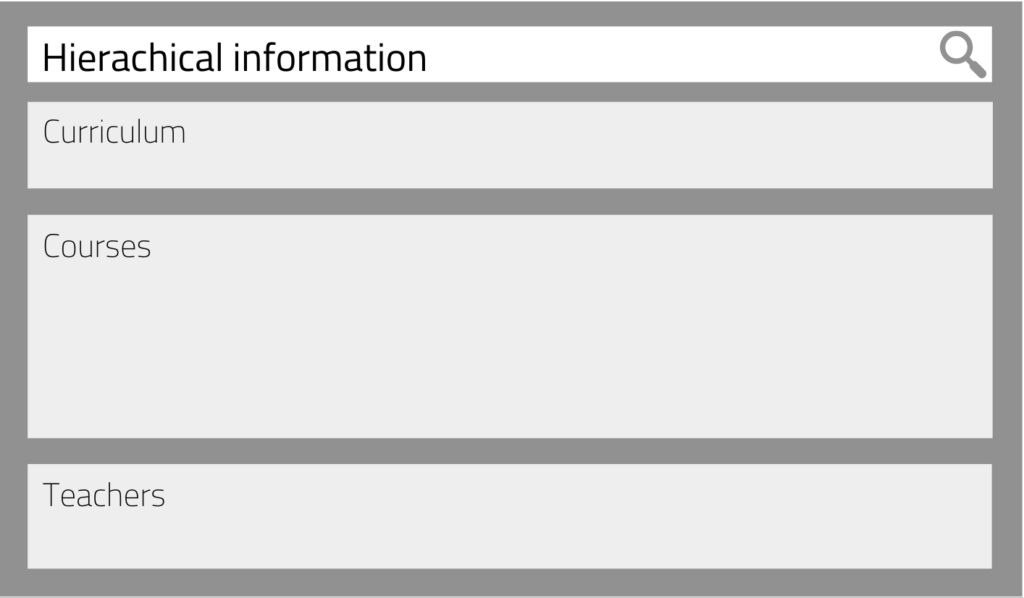
Hierarchical information
Content types are hierarchically organized when they are related and are either “above,” “below,” or “on the same level” to each other.
Matching layouts:
Hierarchically organized information is probably the most difficult to represent understandably. That’s why we recommend that you opt for a more straightforward layout. Create a vertical or a combination of a vertical and horizontal layout. Using other design elements such as colors, fonts, and whitespace helps users understand how search results and segments correlate.
While the other information structures work well with instant search (like we have on our site), the hierarchical content often works better on a separate results page due to its complexity. As a result, you usually also have more space and design options available that can help users quickly understand your segmented search and get the results they want.
Example use case:
Imagine designing segmented search results for an online academy. Let’s see how the content types in this example could relate to each other: each curriculum can have one or more courses, and each course has a teacher, which means that every curriculum has one or more teachers.
Using segments as discussed to display search results from these different content types already helps users find what they’re looking for faster than traditional search design. Therefore, it’s not always necessary to accurately represent the hierarchy of content. However, as mentioned above, you can use other design elements to clarify the hierarchy and improve the search experience.
AddSearch tip:
After all, the most important thing is that users find what they’re looking for quickly. Ensure that you always prioritize the user experience, and you should be able to create great segmented search UIs for even the most complex hierarchical information structures.
Building a segmented search results UI with AddSearch
Finally, let’s talk about what to do if you want to design and implement segmented search results for your website.
As mentioned before, here are some things to check beforehand:
- What types of content do you provide on your website?
- Do you want to offer search results from different websites? If so, what types of content do you provide on other websites?
- What’s the most popular content with users, and what’s most important to your business?
- How do content types relate to each other? Is the information organization parallel, complementary or hierarchical?
Answering these questions helps you define your search result segments, their relationships to one another, and the ideal layout.
Next, you’ll want to design and implement your segmented search. As an AddSearch customer, you can use our Search UI library, which supports segmented search out of the box. It allows you to create any of the layouts described in this blog post and populate segments with search results from your website.
Our search experts can help you implement the ideal user interface for segmented search results if you are subscribed to our Premium or Enterprise plans. Naturally, the use of our Search UI library is available to all plans free of charge.
Reach out to our support channels if you run into technical problems or have any questions.
We’re always happy to help you out!


