Schools and universities have rapidly embraced digitalization in the past years. They are also realizing the importance of site search for their higher education websites. The coronavirus pandemic, which forced many educational institutions to go from in-person teaching to online teaching within weeks, expedited this process even more.
But site search is a part of digital transformation that sometimes gets overlooked, even though it has an impact on how many students enroll and how satisfied students are. Websites of universities or colleges are filled with important content: course schedules, information about degrees, and teacher profiles. Without an effective way to sort and filter through all of this information, you can easily lose a potential student, as well as leave your current students frustrated when they can’t find the details they were looking for.
Why you need great site search as an educational institution
We all know what a search done well looks like because we are using Google on a daily basis. Students expect the same from their school’s website. Great site search makes the experience on a website seamless. Ideally, your student won’t even think about your search feature because it’s an intuitive tool. However, when the search goes wrong, the frustration can be big. For example, when a student wants to find a course they want to enroll in but the search results only include teachers from the department.
The challenge of running a website for an educational institution is to support different user profiles. The website should have easy access to information for potential students on what it’s like to study at this school while at the same time providing all the necessary details your current students need. Your site search and how easily accessible the answers to your users’ questions play a part in who will ultimately join your university or buy your courses.
Creating a seamless search experience does not have to be hard. In this article, we will showcase four best examples of well-designed site searches for your educational institution. (Hint: All of the examples use AddSearch for easy implementation.)
Educational Website Site Search Examples
Incorporating an effective search feature is essential for educational websites to help users find the content they need quickly. Below are some examples of well-designed site search functionalities that enhance user experience on educational platforms:
#1: Robert Gordon University Aberdeen
Aberdeen’s Robert Gordon University is the top university in Scotland for graduate prospects. It has an international reputation for management, health, energy, and technology courses.
Filters and sorting
Education institutes often offer courses for different levels (e. g. Bachelor/Master, Undergraduate/Postgraduate). A filter or sorting function that lets the user choose the option suitable to them allows them to fine-tune their search. Usually, these elements are only displayed when the user is already on the search result page, but in the case of Robert Gordon University, they decided to offer their users the chance to filter from the start. This simple adjustment makes it easier for the student to get the optimum out of the search’s features without feeling overwhelmed or distracted.

Offer additional relevant information
If you have potential students looking for courses and classes, they want to know instantly what they are applying for. This simple implementation at Robert Gordon’s University offers already clear information on the title you would achieve (BA, BSc, etc.) within the search results. It gives an additional layer of information without feeling cluttered and makes it trouble-free for your users to find the right studies for their needs.
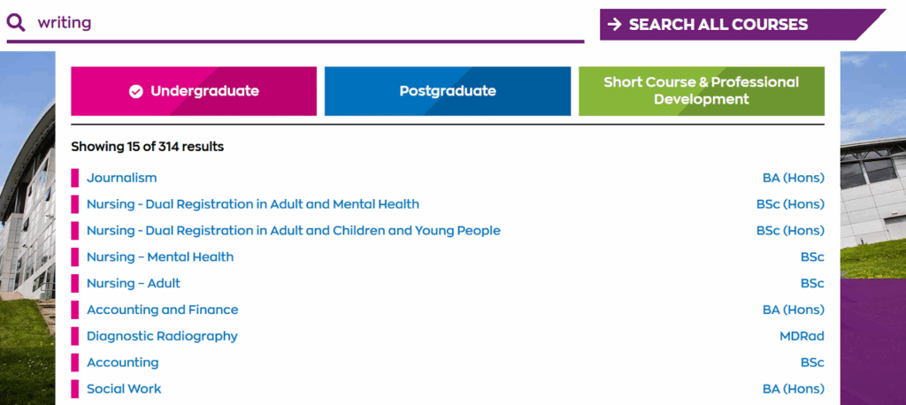
Updating your site search with these simple tweaks pays off: Since changing to AddSearch, Robert Gordon’s University has seen an increase of 30% in traffic to our course pages. “The new search has played a major role in this,” said Sean Brosnan, Digital Content Manager. Our students and academic staff found the search much more user-friendly.”
#2 University of Phoenix
The University of Phoenix is a private university in Phoenix, Arizona, which offers online degrees and courses aligned to 300+ occupations.
Simple search box with prompt text
When you offer a site search option, you want to make sure to use familiar symbols and copy for your search bar. In this case, the University of Phoenix uses a clear prompt text that states “search” and uses a familiar symbol, the magnifying glass icon. Both of these simple adjustments make using your website search a no-brainer.

In addition, the university chose to have some info about their scholarships and a clear call to action right underneath their search bar. This way, potential students can inform themselves about financing which is a high-priority topic for many high school students looking for the right college.
Show quick search suggestions
Your site search feature can also guide your users to the pages that matter the most to them. The University of Phoenix does this by offering a quick search feature for some of the most relevant topics for their potential students. Once again, they offer a call-to-action (“request info”) that leads the website visitor to a form they can fill out with their basic info. A simple trick that allows the sales department to collect the email of a potential student and reach out to them.

Offer autocomplete
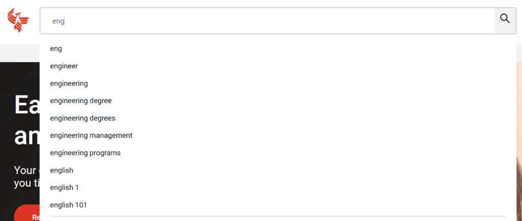
Thanks to Google, most of us are used to typing a few letters into the search bar and getting suggestions for our search. Autocomplete makes it easier for your website visitors to find what they are looking for. The University of Phoenix offers autocomplete with their site search, so users won’t have to enter every single letter and can quickly find the information they need.
#3 Point Loma Nazarene University
Point Loma Nazarene University is a private Liberal Arts college at the oceanfront in San Diego, California. They have around 3,500 students each year and offer smaller class sizes.
Show top searches and timely content
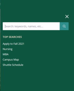
If you’re running an educational institution, you want students to find what they are looking for fast. Especially if you are targeting a younger generation, who grew up with the internet and expects to find results with ease. In the case of Point Loma Nazarene University, they decided to make it easy for their users to find the top searches before even typing in any keyword. They also offer a timely top search – “Apply to Fall 2021” – that leads the visitor to all the information they need to apply for their spot at the university.
Organize and promote search results by categories
Segmenting search results helps to ensure that there is something of value for every visitor – no matter if they are current or potential students. When you use the site search on Point Loma’s website, the results are put into clear categories (all programs, faculty, resources, and events). The clear separate sections present the user with the most important segments while offering a relevant mix of content.
Also, Point Loma prioritizes certain search results in their “all” category. As you can see in the example, relevant programs or courses are shown before information about departments or faculty. Many advanced search tools let you add or remove “weight” from specific pages or sections of your website to promote your most critical pages, so your visitors can easily find them.

#4 Harper Adams University
Harper Adams University is the leading higher education provider of land-based education in the UK.
Design and optimize your search for mobile devices
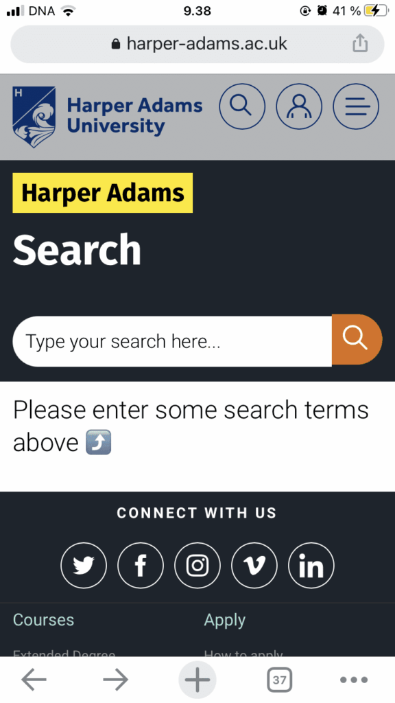
50.44% of all global web traffic is mobile – and this number is continuously growing. Optimizing your website and site search for smartphones and tablets should be a must on any website owner’s to-do list. Many designers (including ours at AddSearch) start designing the mobile version of the search because some design ideas don’t work on mobile or are harder to implement. In the case of Harper Adams University, the search feature is clearly optimized for mobile with a call-to-action that sends the user to the search bar (“Please enter some search terms above.”).
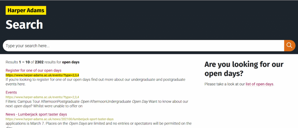
Promote events and open days
Open days are one of the most important events during the year for educational institutions. They give students a chance to check out the campus and get a feel for what it’s like to study at this particular college or university. If you don’t want your students to miss out on these events, one simple way to ensure that they can join is to promote your upcoming events in a temporary or permanent promotional banner within your search results. In the case of Harper Adams, they chose to have an easy way to access the list of open days right next to the search result list.
Why educational websites should integrate AddSearch
Here are five reasons why educational websites should integrate AddSearch for their site search:
- Enhanced Search Accuracy
AddSearch uses advanced algorithms to deliver highly relevant and precise search results, helping students and visitors quickly find the educational content they need. - Customizable Search Features
With AddSearch, educational websites can customize search filters, sorting options, and result layouts to suit their specific needs, ensuring a tailored user experience. - Fast and Efficient Search Experience
AddSearch is optimized for speed, providing fast search results even with large amounts of content, ensuring that users don’t get frustrated by slow loading times. - Mobile-Friendly
AddSearch is fully responsive and works seamlessly across all devices, ensuring that students and educators have a smooth search experience on smartphones, tablets, and desktops.
- Analytics and Insights
AddSearch offers powerful search analytics that help educational websites understand how users interact with their content, providing valuable insights for improving site navigation and content strategy.
Also Check: The AddSearch Recommend Feature For Education Websites
Looking for a site search feature for your educational website?
Site search for educational institutions does not have to be hard. In fact, there are many easy and simple tools out there that make site search a feature you like to use instead of getting frustrated.
AddSearch offers a site search feature for many educational institutions all over the globe, including the four examples in this text. If you are looking for a site search solution that provides accurate search results while meeting required standards without putting excessive strain on scarce IT resources, you can contact us here.
“With AddSearch API, we built search as we wanted. Clear documentation and great fast support made it really easy to connect and achieve good results.”
– Stephanie Baxter, Senior Web & Applications Developer at Robert Gordon University.


